Colophon — Theme Documentation
Colophon is an editorial theme for brands that treat their storefront like a publication. The look is quiet and premium; the features are general-purpose, so it suits any catalog. Everything in this guide is done in the Shopify theme editor (Online Store → Themes → Customize). No code is required.
1. Before you start
Requirements
- Any Shopify plan. No paid apps are needed.
- Recommended free Shopify app: Search & Discovery. It powers the filters on collection and search pages and lets you set product recommendations and colour swatches.
- Supported browsers: the latest two versions of Chrome, Safari, Firefox and Edge, plus iOS Safari and Android Chrome.
Installing the theme
- Add Colophon from the Shopify Theme Store, or upload the theme ZIP under Online Store → Themes → Add theme.
- Click Customize to open the theme editor.
- When you are happy, click Publish.
Where things live in the editor
| Where | What you set there |
|---|---|
| Theme settings (paint-brush icon, bottom-left) | Global choices: logo, colours, fonts, layout, product cards, cart, search, motion, social links. |
| Sections (left sidebar) | The content of each page: header, footer, homepage sections, product page blocks. |
| Blocks (inside a section) | Reorderable items inside a section, for example a slide, a menu column, or the price on the product page. |
2. Quick setup checklist
Work through this list once and the store is ready to sell.
- Pick a style. Theme settings → choose Colophon, Deckle, Ink or Selvedge (see section 3).
- Logo and favicon. Theme settings → Logo. Upload a logo (PNG or SVG with a transparent background) and a square favicon.
- Menus. In Shopify admin, Online Store → Navigation, create:
- Main menu (handle
main-menu) for the header. - Footer (handle
footer) for the footer menu column. - Optional: a secondary header menu (for example "Explore"), and one menu per collection for subcategory pills (see section 10).
- Main menu (handle
- Colours and fonts. Theme settings → Colors and Typography.
- Social links and contact details. Theme settings → Social media and Contact.
- Free shipping threshold. Theme settings → Cart.
- Homepage. Replace the demo images and text in each section with your own.
- Product page. Reorder or remove blocks under the Product information section.
- Install Search & Discovery and switch on the filters you want.
- Pages. Create About, Contact and FAQ pages and assign the matching templates (see section 14).
- Gift card product. If you sell gift cards, the gift-card product template is ready to use.
- Check mobile. Use the device toggle at the top of the editor.
3. Styles (presets)
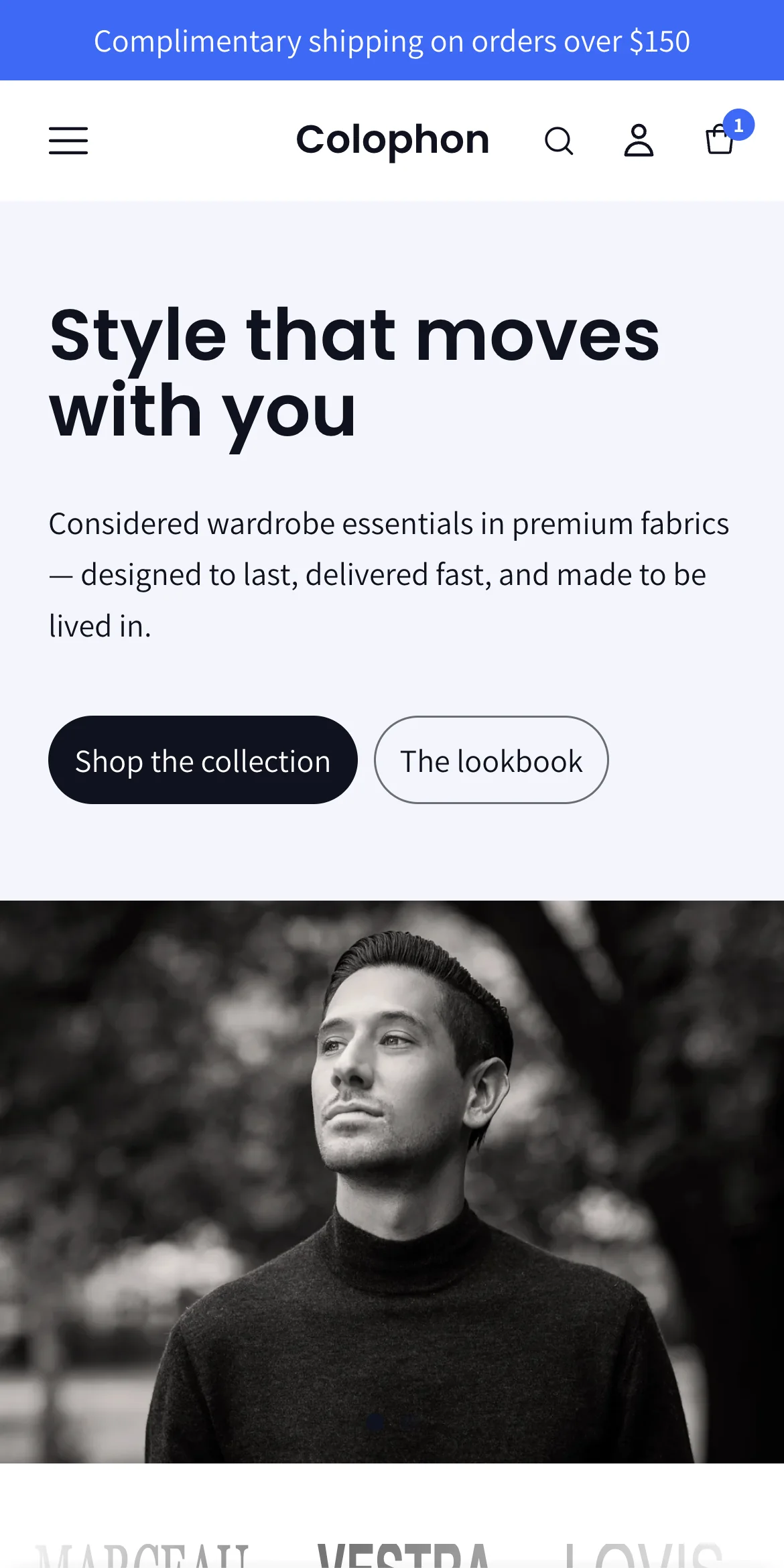
Colophon ships with four styles. Each style is a complete look: colour schemes, fonts, corner radius and button styling. Switching a style changes the design only. Your text, images and products stay as they are.
| Style | Look | Fonts (default) | Best for |
|---|---|---|---|
| Colophon | Bright and modern. White backgrounds, electric-blue accent, soft 16 px corners and pill buttons. | Poppins headings, Assistant body | Contemporary fashion, fast-moving catalogs |
| Deckle | Editorial ivory and ink. Warm off-white backgrounds, sharp corners, serif headings. | Playfair Display headings, Assistant body | Design-led and quiet-luxury brands |
| Ink | Dark and dramatic. Near-black backgrounds with warm light text, sharp corners. | Theme defaults | Image-led storytelling, premium menswear, beauty |
| Selvedge | Warm heritage tones. Linen and tan backgrounds, deep brown text. | Theme defaults | Craft, materials, slow goods, home |
To change the style: Theme settings → scroll to the bottom → Change theme style, choose one and Save.
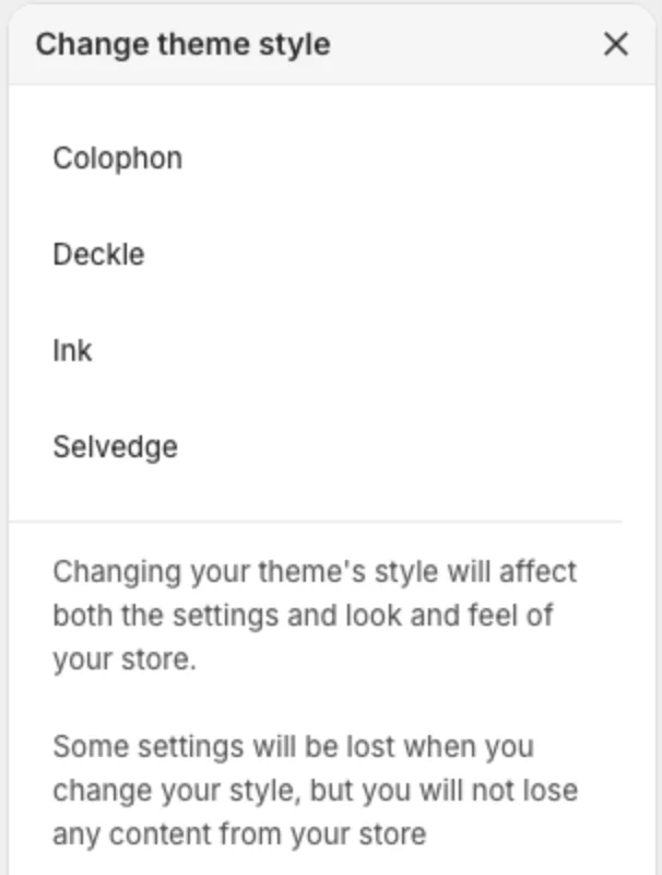
Every style defines four colour schemes (see Colors below), so any section can switch between a light, dark, tinted or inverted look without leaving the style.
About the screenshots in this guide: they were taken in the Colophon style. Deckle, Ink and Selvedge have exactly the same sections, blocks and settings in the same places; only the colours, fonts and default values you see will differ.
4. Theme settings
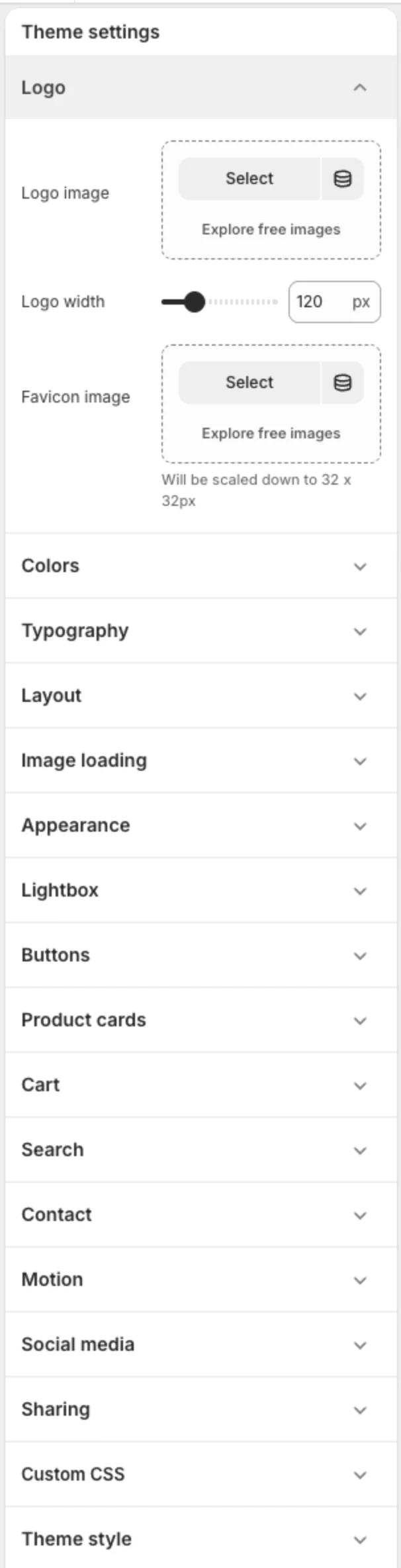
Open Theme settings from the bottom-left of the editor. The groups are listed in the order you will see them.
Logo
| Setting | What it does |
|---|---|
| Logo image | Shown in the header. Use a PNG or SVG with a transparent background, at least 600 px wide. |
| Logo width | Display width in the header (60 to 320 px). |
| Favicon image | The small icon in the browser tab. Upload a square image; it is scaled to 32 × 32 px. |
Colors
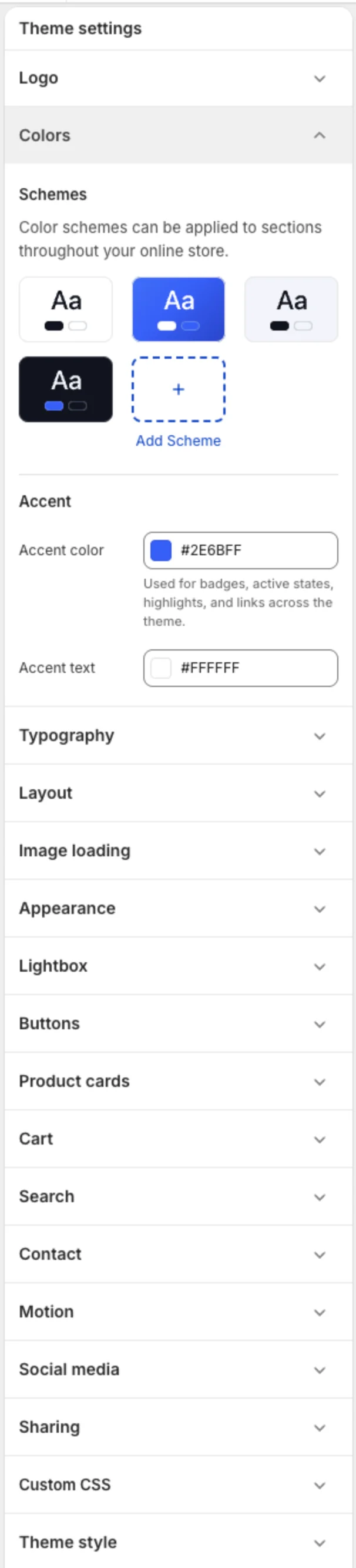
Colophon uses colour schemes: named sets of background, text, button and border colours. Each style ships four schemes:
- Scheme 1 — the main page background and text.
- Scheme 2 — the inverted scheme (for example blue with white text, or black with cream text). Used for the announcement bar and strong call-outs.
- Scheme 3 — a soft tinted background for quieter sections such as newsletters and heroes.
- Scheme 4 — a second contrast scheme for dark or pure-white sections.
Every section and many blocks have a Color scheme setting, so you can mix schemes down the page. Edit any scheme's colours by clicking it under Theme settings → Colors.
| Setting | What it does |
|---|---|
| Accent color | One colour used everywhere for badges, active states, links and highlights. |
| Accent text | The text colour placed on top of the accent colour. Keep the contrast high. |
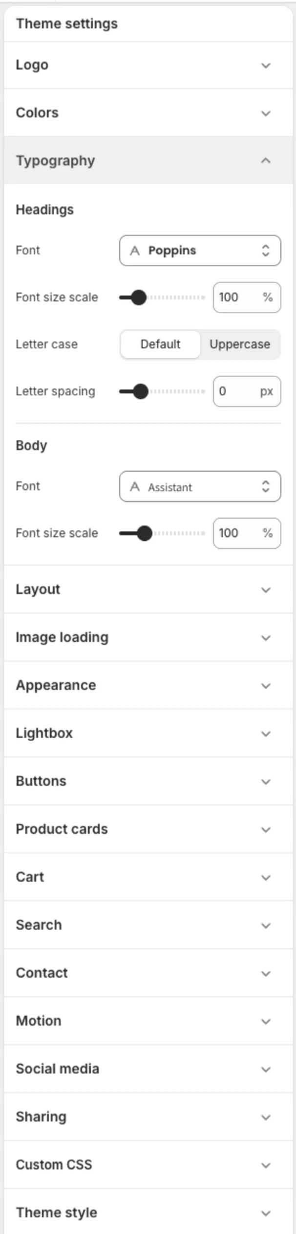
Typography
| Setting | What it does |
|---|---|
| Headings → Font | Any Shopify font. Serif fonts suit Deckle and Selvedge; a geometric sans-serif suits Colophon and Ink. |
| Headings → Font size scale | Scales every heading together (90 to 150 %). |
| Headings → Letter case | Default or Uppercase. |
| Headings → Letter spacing | Tighter or wider tracking for headings. |
| Body → Font | The font for paragraphs, prices, buttons and menus. |
| Body → Font size scale | Scales all body text (90 to 130 %). |
Layout
| Setting | What it does |
|---|---|
| Page width | Maximum content width on large screens (1200 to 1800 px). |
| Page margin | Space between the content and the edge of the screen. |
| Spacing between sections | Extra gap added between every section. Leave at 0 and use each section's own padding for finer control. |
| Grid spacing | Gap between product cards and grid tiles. |
| Pagination style | How collection, search and blog pages load more items: Numbered pages, Load more button or Infinite scroll. |
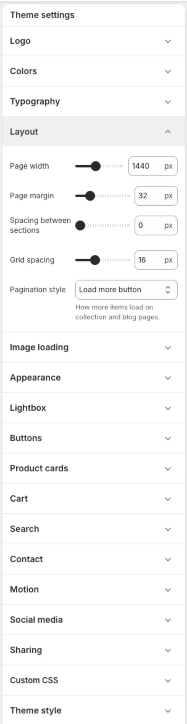
Image loading
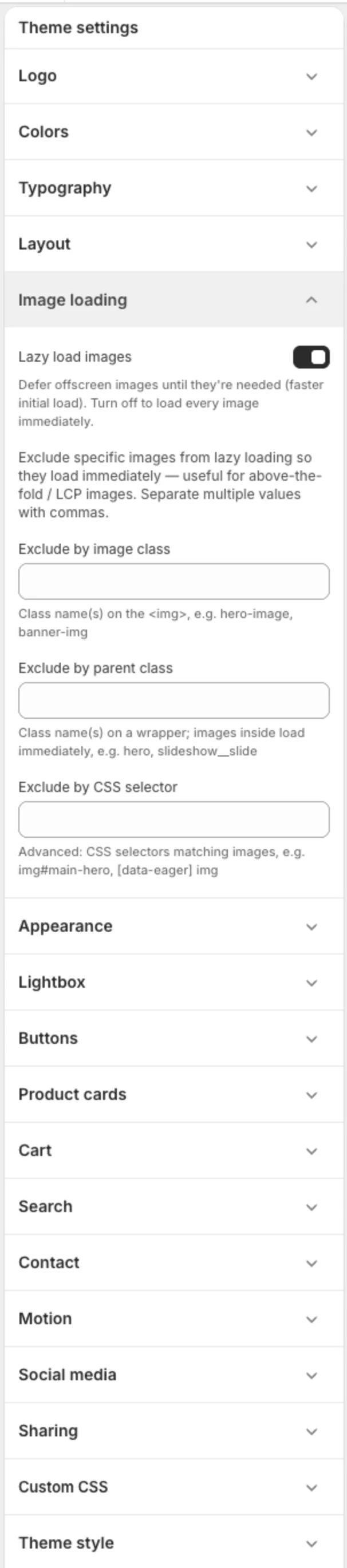
| Setting | What it does |
|---|---|
| Lazy load images | On by default. Images below the fold load as the visitor scrolls, which keeps pages fast. |
| Exclude by image class / parent class / CSS selector | Advanced. Lets you force specific images (for example your hero) to load immediately. Separate values with commas. Most stores never need to change these. |
Appearance
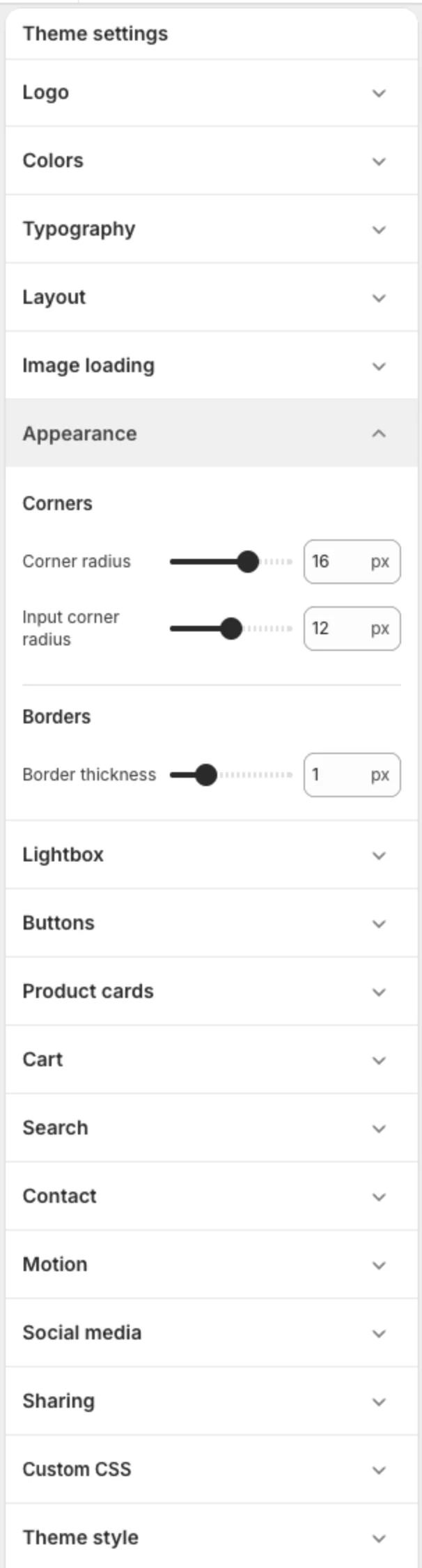
| Setting | What it does |
|---|---|
| Corner radius | Rounds the corners of cards, images and panels (0 to 24 px). |
| Input corner radius | Rounds form fields separately. |
| Border thickness | Thickness of borders on cards, inputs and dividers (0 to 4 px). |
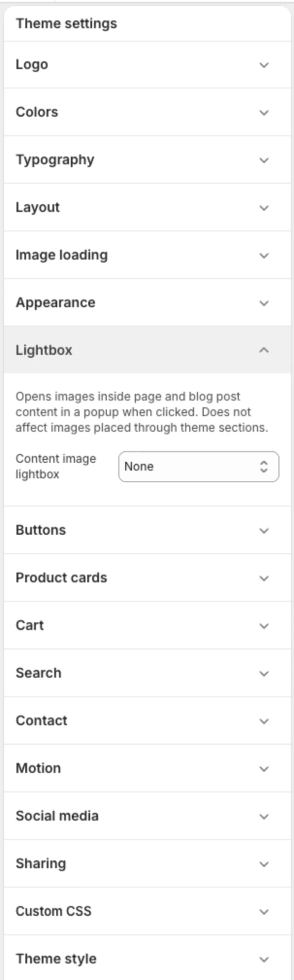
Lightbox
| Setting | What it does |
|---|---|
| Content image lightbox | When set to Open image in lightbox, images inside page and blog-post content open in a full-screen viewer when clicked. Images placed through sections are not affected. |
Buttons
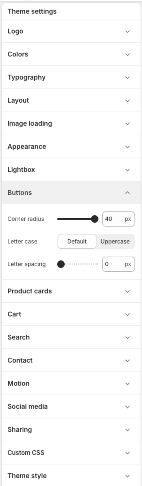
| Setting | What it does |
|---|---|
| Corner radius | 0 for square buttons, 40 for fully rounded pills. |
| Letter case | Default or Uppercase. |
| Letter spacing | Tracking for button labels. |
Product cards
These settings apply to every product card in the store: collections, search, featured collections, recommendations and tabbed products. See section 9 for the full guide.
Cart
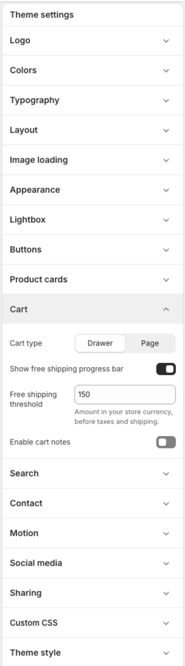
| Setting | What it does |
|---|---|
| Cart type | Drawer opens a side panel when an item is added. Page sends the customer to the cart page. |
| Show free shipping progress bar | Shows how far the customer is from free shipping. |
| Free shipping threshold | The amount (in your store currency, before taxes and shipping) that unlocks free shipping. Set it to match your shipping rates. |
| Enable cart notes | Lets customers add an order note in the cart. |
Search
Controls how search looks and what the live results panel shows. See section 11.
Contact
| Setting | What it does |
|---|---|
| Phone number | Shown in the search panel and used for click-to-call links. |
| WhatsApp number | Digits only, with country code (for example 15551234567). Creates a WhatsApp chat link. |
| Email address | Shown in the search panel. |
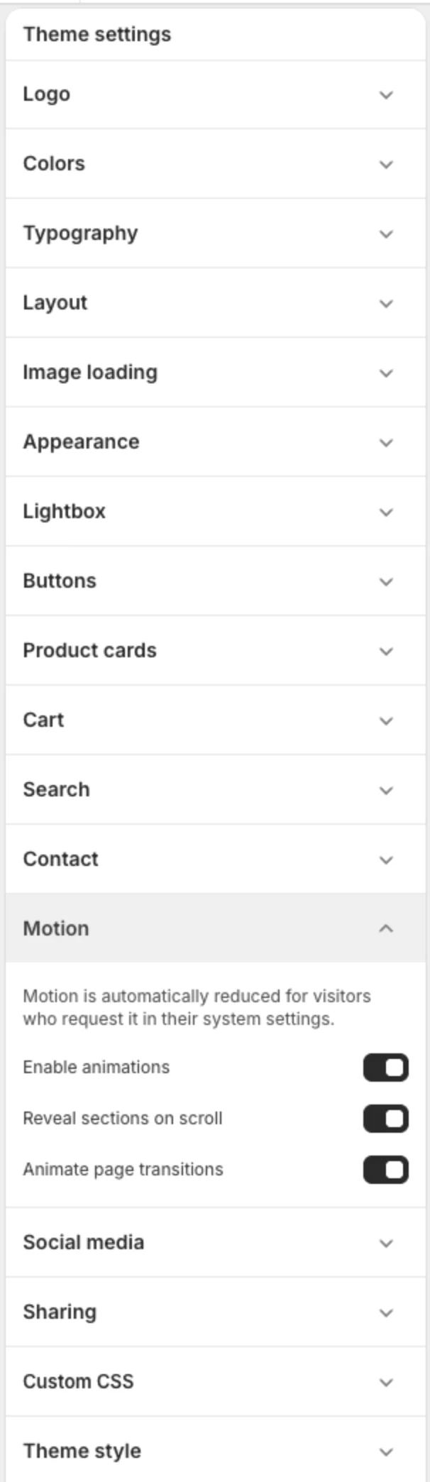
Motion
| Setting | What it does |
|---|---|
| Enable animations | Master switch for hover effects and transitions. |
| Reveal sections on scroll | Sections fade or slide in as they enter the screen. Each section can pick its own reveal animation or opt out. |
| Animate page transitions | A soft fade between pages. |
All motion is automatically reduced for visitors who have "reduce motion" switched on in their device settings.
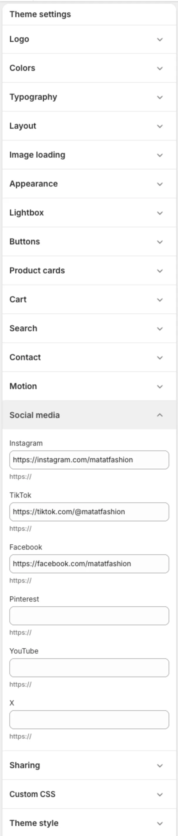
Social media
Paste the full URL (starting with https://) for Instagram, TikTok, Facebook, Pinterest, YouTube and X. Icons appear in the footer only for the links you fill in.
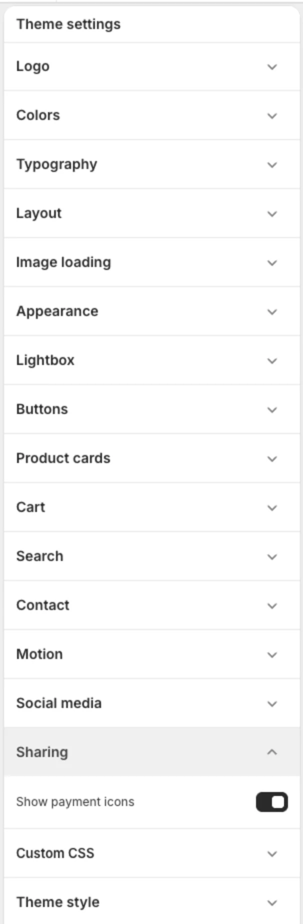
Sharing
| Setting | What it does |
|---|---|
| Show payment icons | Shows the payment methods your store accepts in the footer. |
5. Header and announcement bar
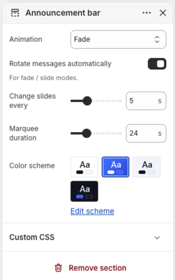
Announcement bar
Add one or more Message blocks, each with text and an optional link.
| Setting | What it does |
|---|---|
| Animation | Fade, Slide horizontal, Slide vertical or Continuous marquee. |
| Rotate messages automatically | For fade and slide modes. |
| Change slides every | Seconds between messages (3 to 10). |
| Marquee duration | How long one marquee pass takes. |
| Color scheme | Defaults to Scheme 2 (inverted). |

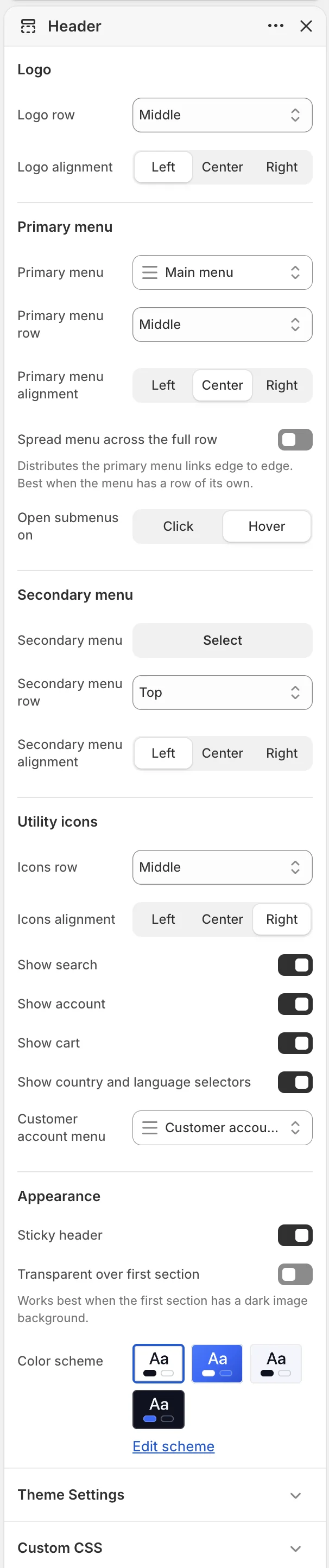
Header layout
The header is built from up to three rows: Top, Middle and Bottom. You decide which row the logo, the primary menu, the secondary menu and the utility icons sit on, and how each is aligned. Rows with nothing on them are not shown.
Examples:
- Classic: logo left, menu left, icons right, all on the Middle row.
- Centred: logo centred on the Middle row, menu centred on the Bottom row, icons right on the Middle row.
- Two menus: a secondary "Explore" menu on the Top row with the main shop menu on the Bottom row.
| Setting | What it does |
|---|---|
| Logo row / Logo alignment | Where the logo sits. |
| Primary menu | The menu to show (defaults to Main menu). |
| Primary menu row / alignment | Where the primary menu sits. |
| Open submenus on | Click or Hover. |
| Secondary menu, row, alignment | An optional second menu, for example editorial or brand links. |
| Icons row / alignment | Where the search, account and cart icons sit. |
| Show search / account / cart | Toggle each icon. |
| Show country and language selectors | Shows selectors when more than one market or language is active. |
| Customer account menu | The menu shown to logged-in customers. |
| Sticky header | Keeps the header visible while scrolling. |
| Transparent over first section | The header floats over the first section with a transparent background. Works best when the first section is a dark hero image. |
| Color scheme | Header colours. |
On phones the menus collapse into a slide-out navigation drawer with the same links and nested items.
Mega menu
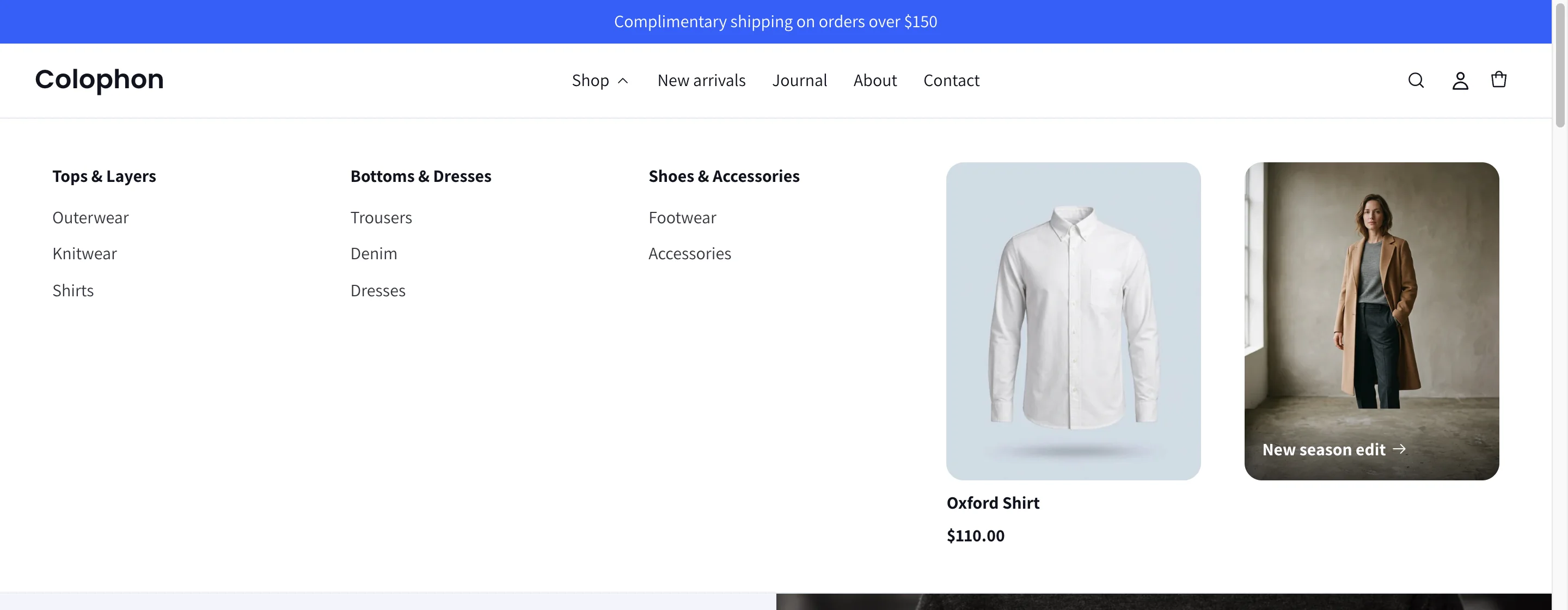
Any top-level menu item can open a rich, multi-column mega menu.
- In the Header section, click Add block → Mega menu.
- In Attach to menu item, type the exact title of the top-level item (for example
Shop). - Set up to five columns. Each column can be:
- Link list — a heading plus a menu of links.
- Feature product — a product image, title and price that links to the product.
- Image banner — an image with a caption shown on the image or below it, and a link.
Items without a mega-menu block use a standard dropdown built from the nested items in your Navigation menu.

6. Footer
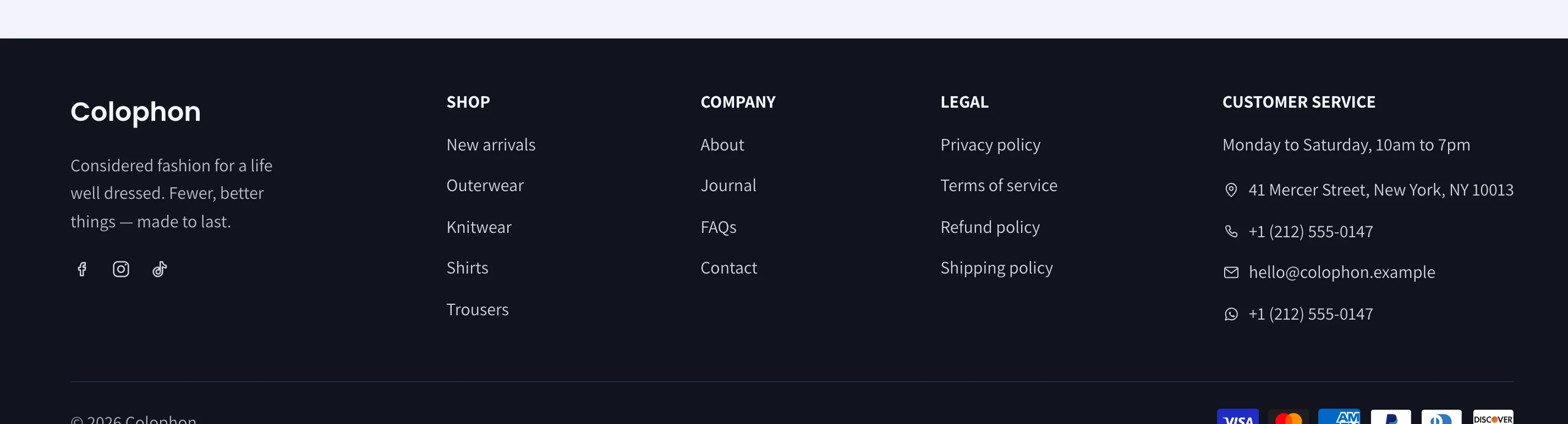
The footer is built from blocks that you add, reorder and size.
| Block | What it does |
|---|---|
| Brand (one per footer) | Your logo and a short tagline. |
| Menu | A heading and a menu. Link columns splits long menus into 1 to 4 columns under one heading. |
| Text | A heading and free text, for example your address or a short story. |
| Newsletter (one per footer) | Email sign-up with heading and text. Full-width row stretches it across the footer. Optional consent checkboxes: a marketing opt-in and a required consent checkbox, each with your own wording. |
| Contact info | A heading (default "Customer service"), an optional line of text such as opening hours, then your address, phone, email and WhatsApp number, each with an icon. Phone and email become click-to-call and click-to-email links; the WhatsApp number (digits with country code) opens a chat. Can also show the social icons from Theme settings. |
| Gift card | A heading and an image, optionally linked to a page or product, for example your gift-card product. |
Each block has a Column width (0 to 5). Columns size to their content and share the space evenly; use a higher number for a block that needs more room.
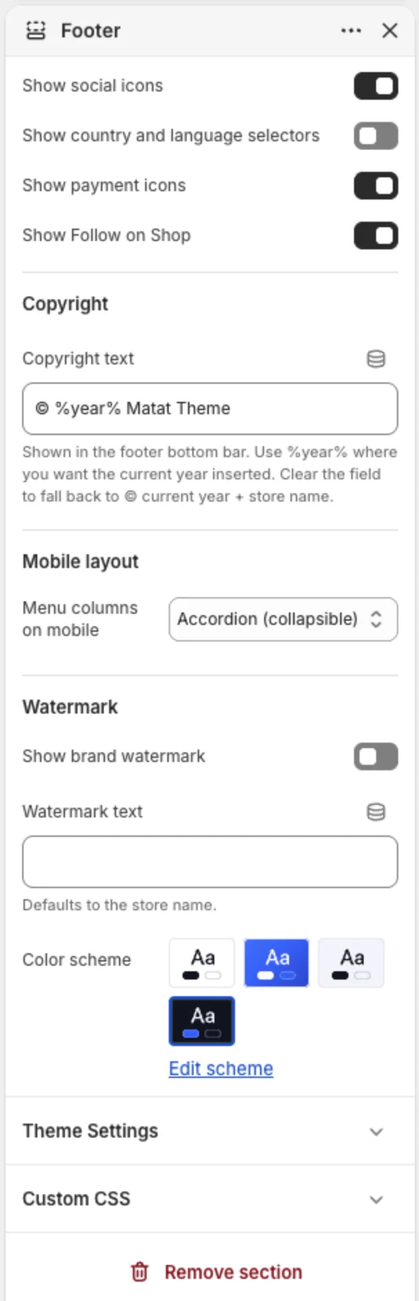
| Section setting | What it does |
|---|---|
| Show social icons | Uses the links from Theme settings → Social media. |
| Show country and language selectors | For multi-market and multi-language stores. |
| Show payment icons | Accepted payment methods. |
| Show Follow on Shop | The Shop app follow button. |
| Copyright text | Use %year% where the current year should appear. Leave empty to show the year and store name automatically. |
| Menu columns on mobile | Accordion (collapsible headings) or Columns. With Columns, choose 1 or 2 columns. |
| Show brand watermark | A large, faded brand name across the bottom of the footer. Defaults to your store name; override with Watermark text. |
| Color scheme | Footer colours. |
7. Homepage and content sections
Add sections to any page with Add section in the left sidebar. Drag to reorder. Every section below shares three common controls:
- Color scheme — pick one of the four schemes.
- Section padding — top and bottom padding, set separately for desktop and mobile.
- Reveal animation — Default, None, or one of about twenty entrance animations (fade, slide, zoom, bounce, flip). Requires Reveal sections on scroll in Theme settings → Motion.
Heroes and banners
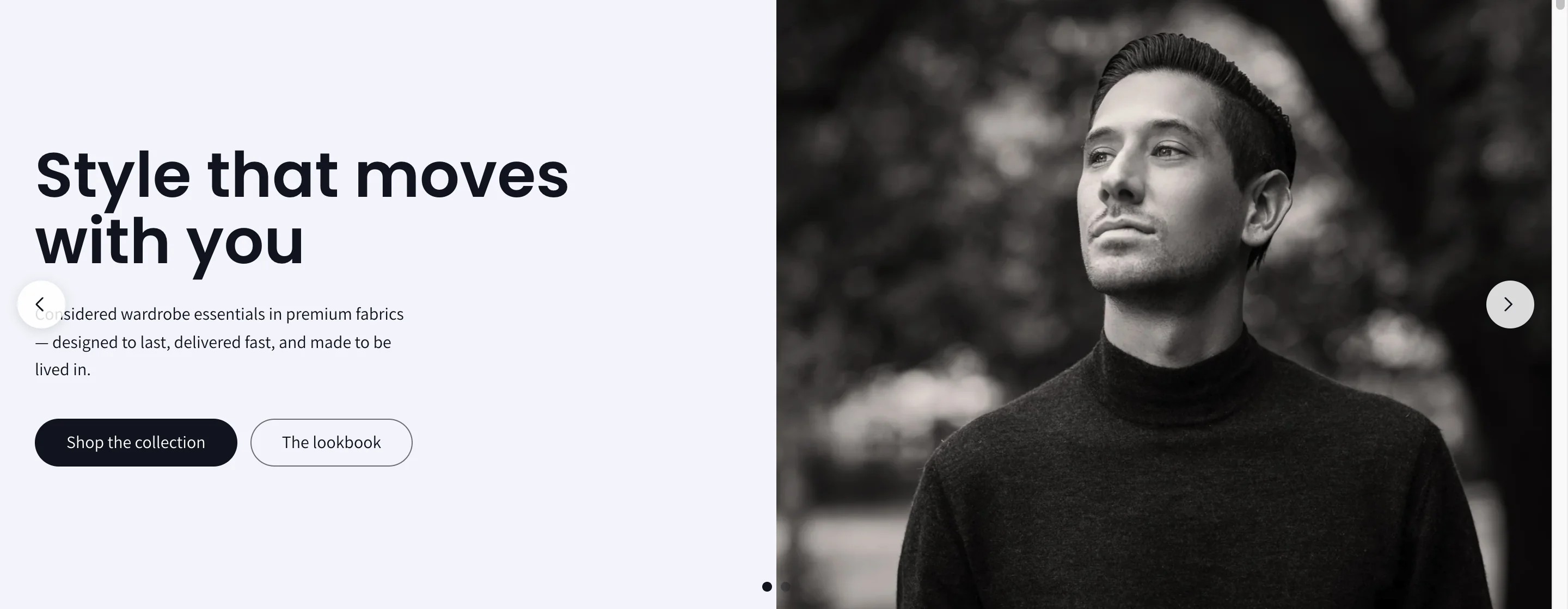
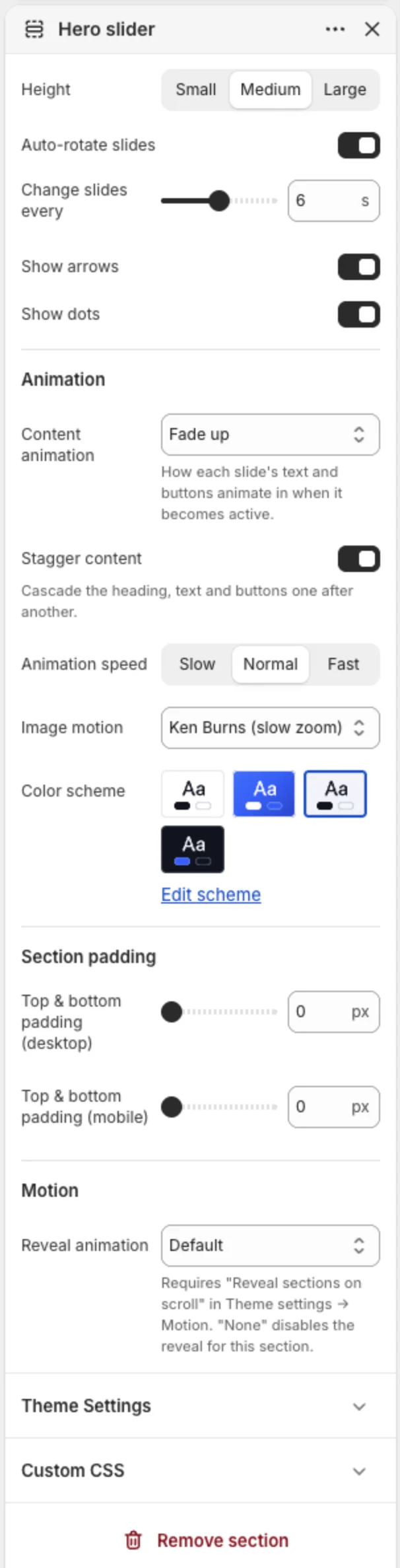
Hero slider — A rotating hero with two slide layouts: Split (a text panel beside the media) or Full-width banner (caption over the media). Each slide can use an image, an uploaded video or a YouTube/Vimeo video, with autoplay or click-to-play. Options: height, auto-rotate and speed, arrows, dots, content animation with stagger and speed, and a slow Ken Burns zoom on images. On phones the arrows are hidden and shoppers swipe between slides; the dots stay visible. Slides can show a short trust badge with stars (fill it with a claim you can back up, or leave it off), a kicker, heading, text and two buttons. Heading tag lets the first slide carry the page's H1.
Slideshow — A simpler full-bleed slideshow. Each slide has a desktop image, an optional mobile image, heading, text, two buttons, text alignment, overlay opacity, a solid or gradient overlay and an optional rating badge. Height can adapt to the first slide.
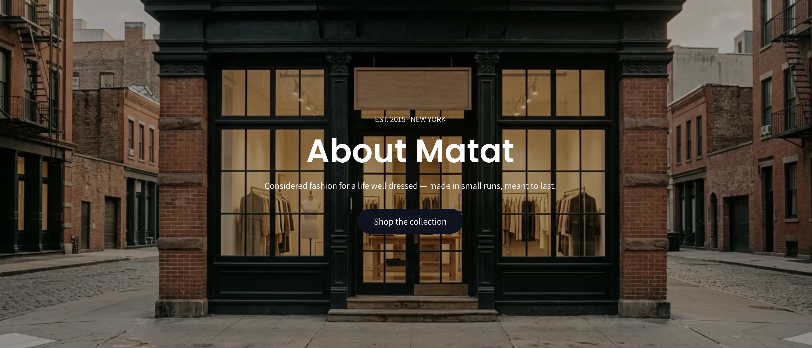
Cinematic hero — One large image or muted looping video with a kicker, heading, text and two buttons. Choose height, overlay opacity and alignment. Custom background and text colours can override the scheme.
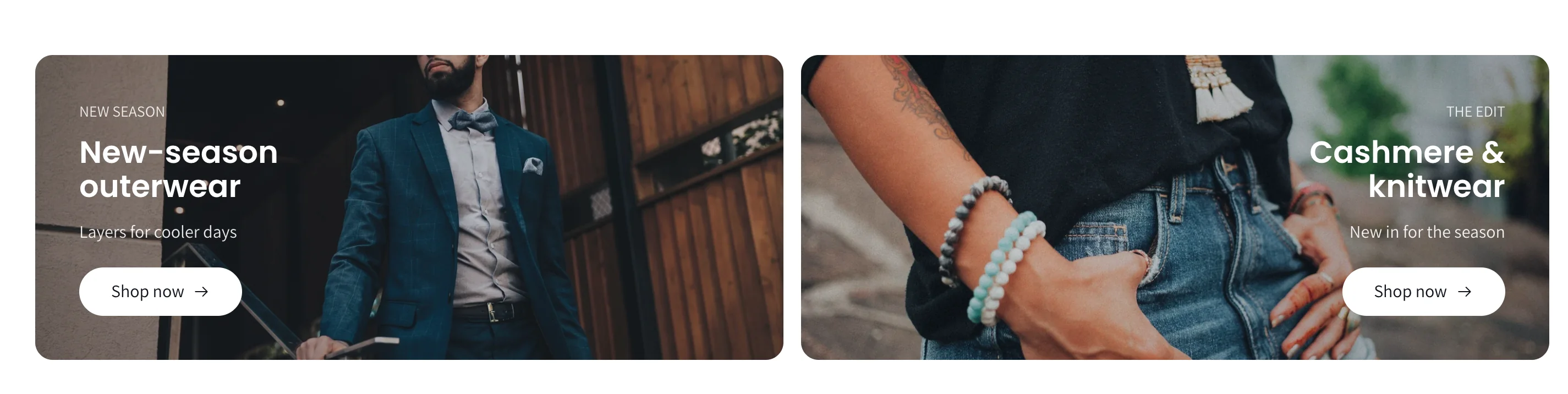
Promo banners — Two or more image cards side by side, each with a kicker, heading, text, button and overlay. Min card width controls how many fit per row.
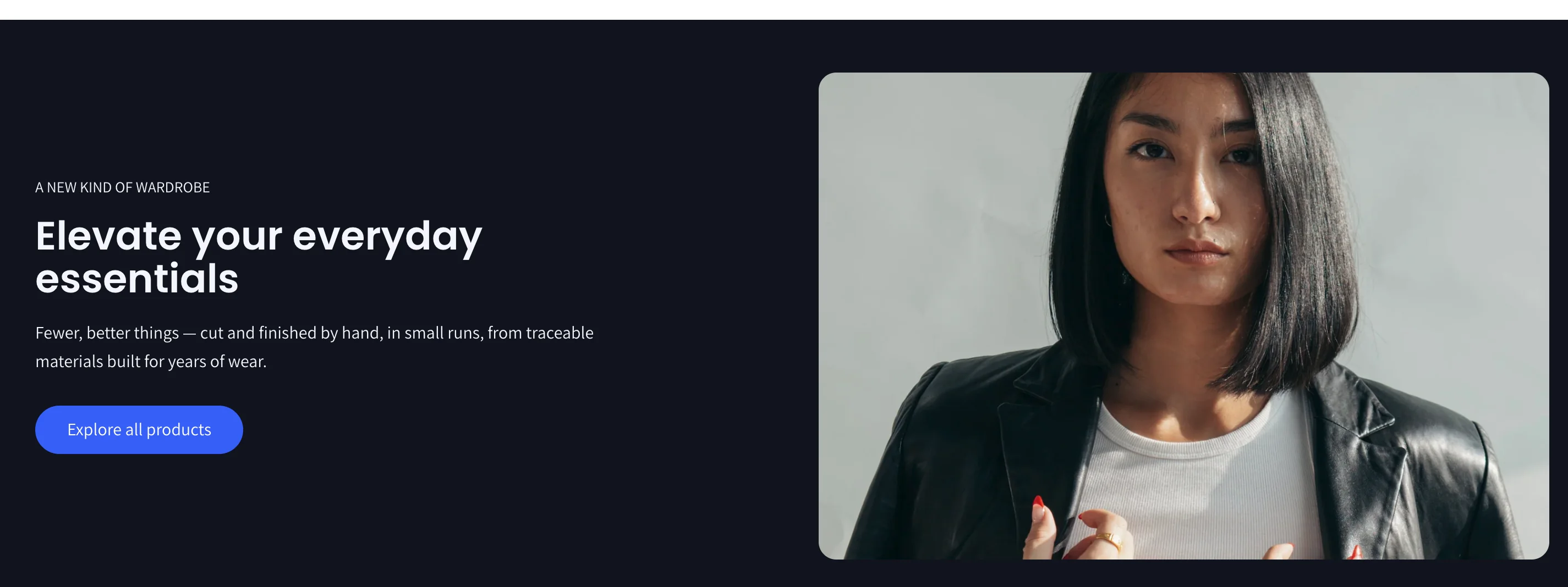
Image with text — One image beside a kicker, heading, text and button. Choose the image side and ratio.
Scrolling text — A continuously scrolling line of text (for example a shipping promise) with speed, direction, size, uppercase and separator options.
Countdown timer — Counts down to a real date and time in the visitor's time zone. When it ends, show a message or hide the section. Optional background image and button.
Products and collections
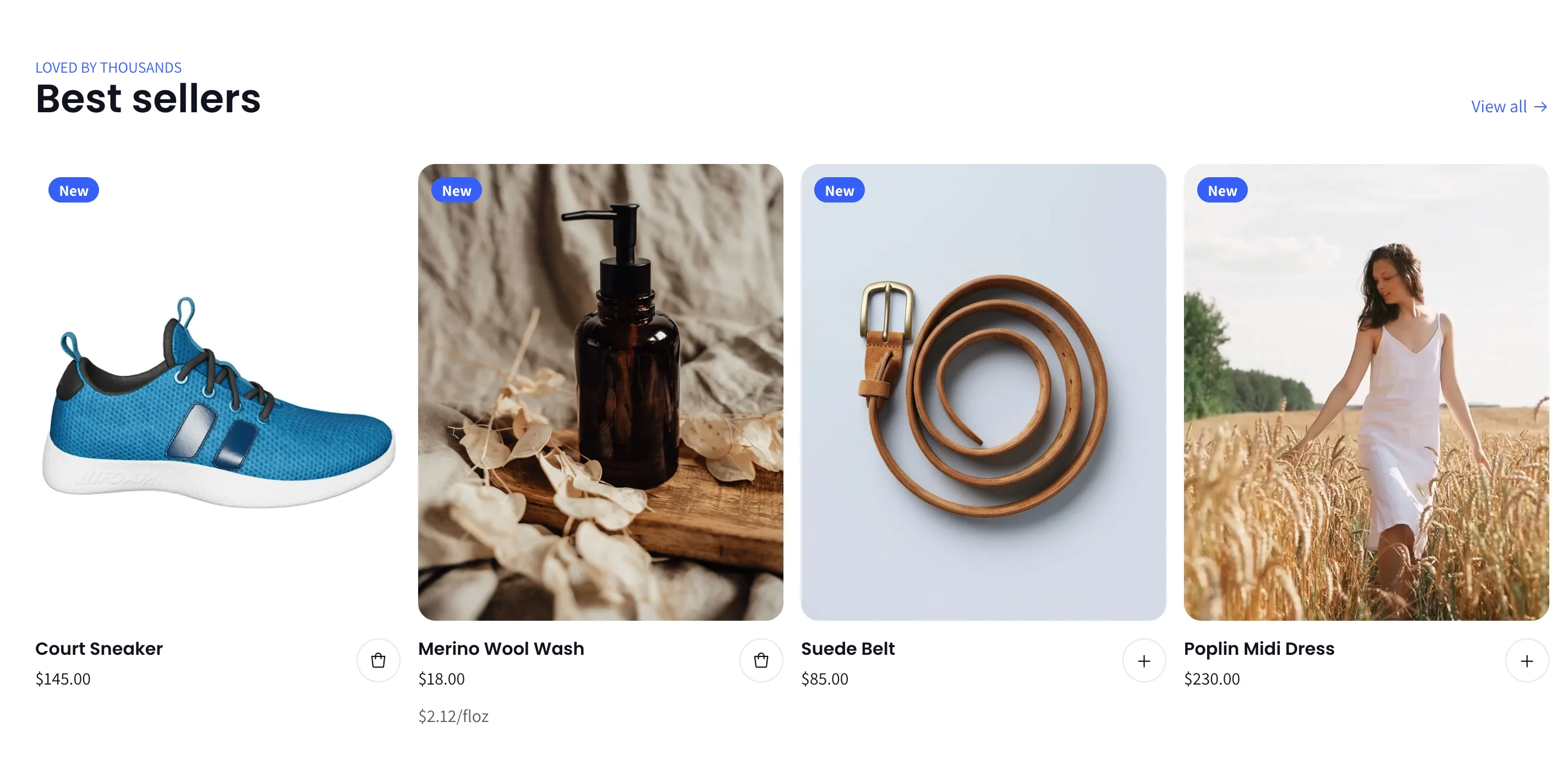
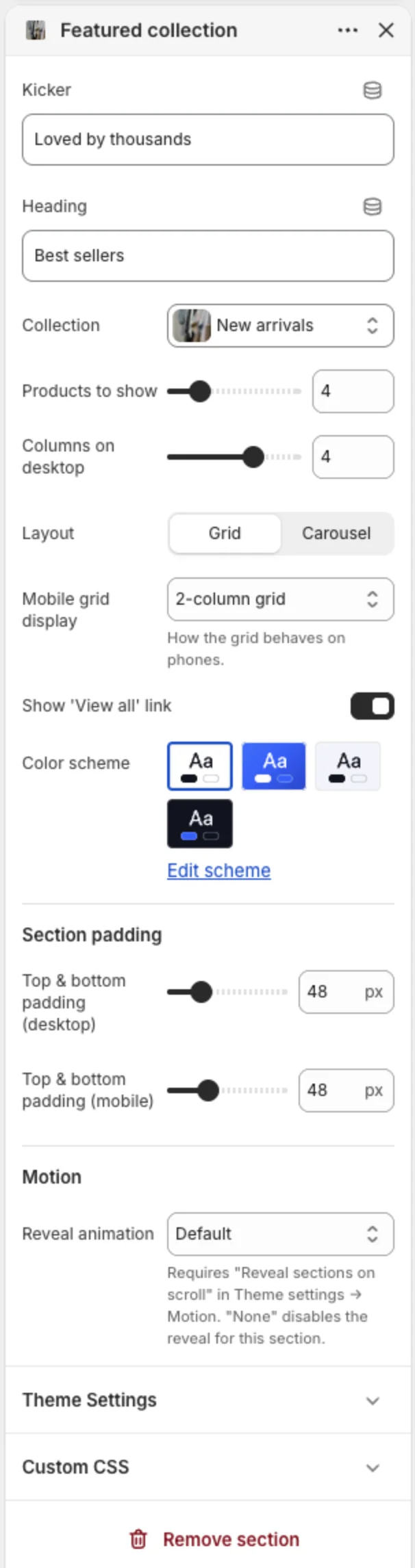
Featured collection — Products from one collection, as a grid or carousel. Options: number of products, desktop columns, mobile layout (2-column grid or swipe), carousel arrow position, dots, autoplay and a "View all" link.
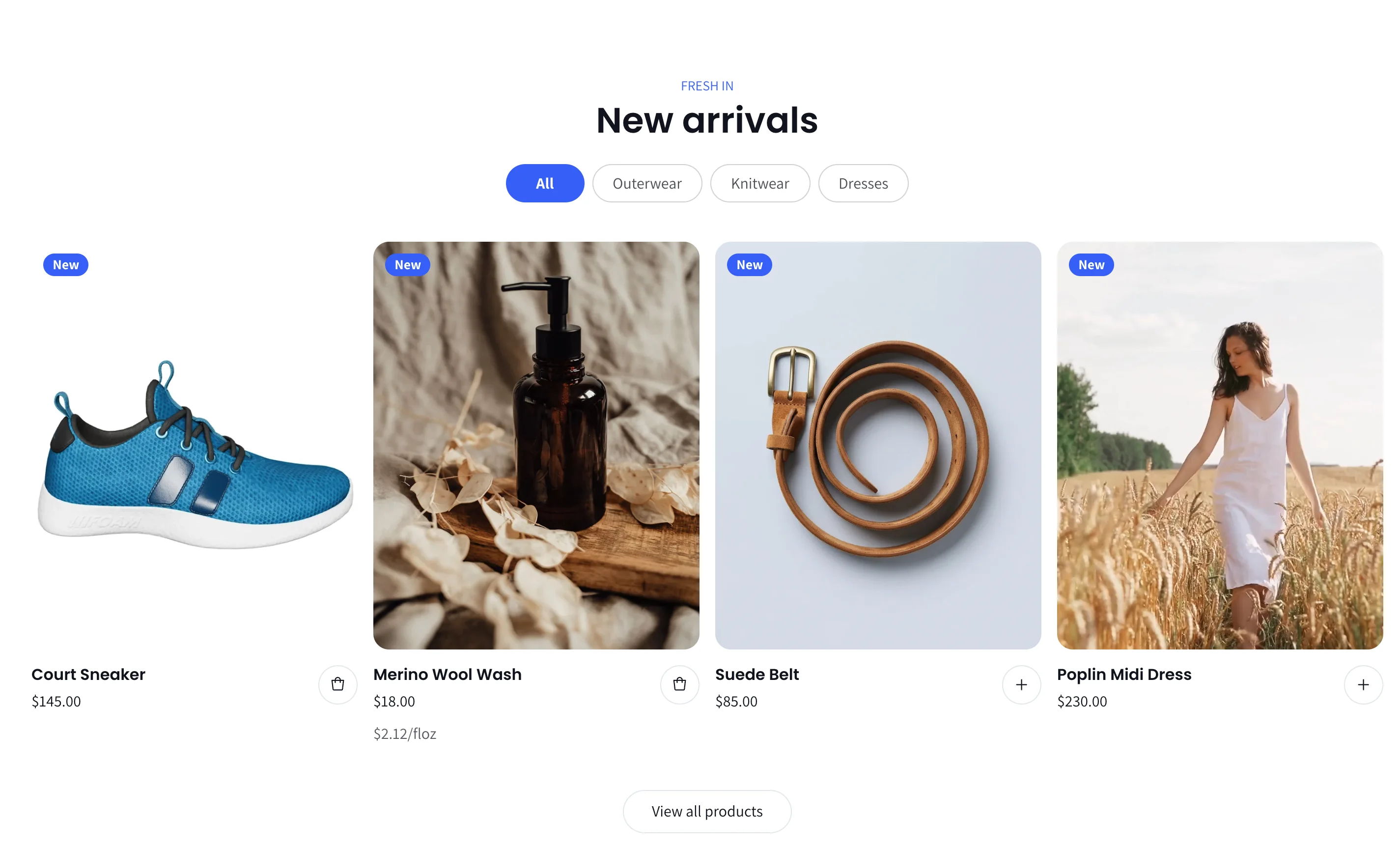
Tabbed products — One product grid with tabs. Add a Tab block per collection; shoppers switch between them without leaving the page.
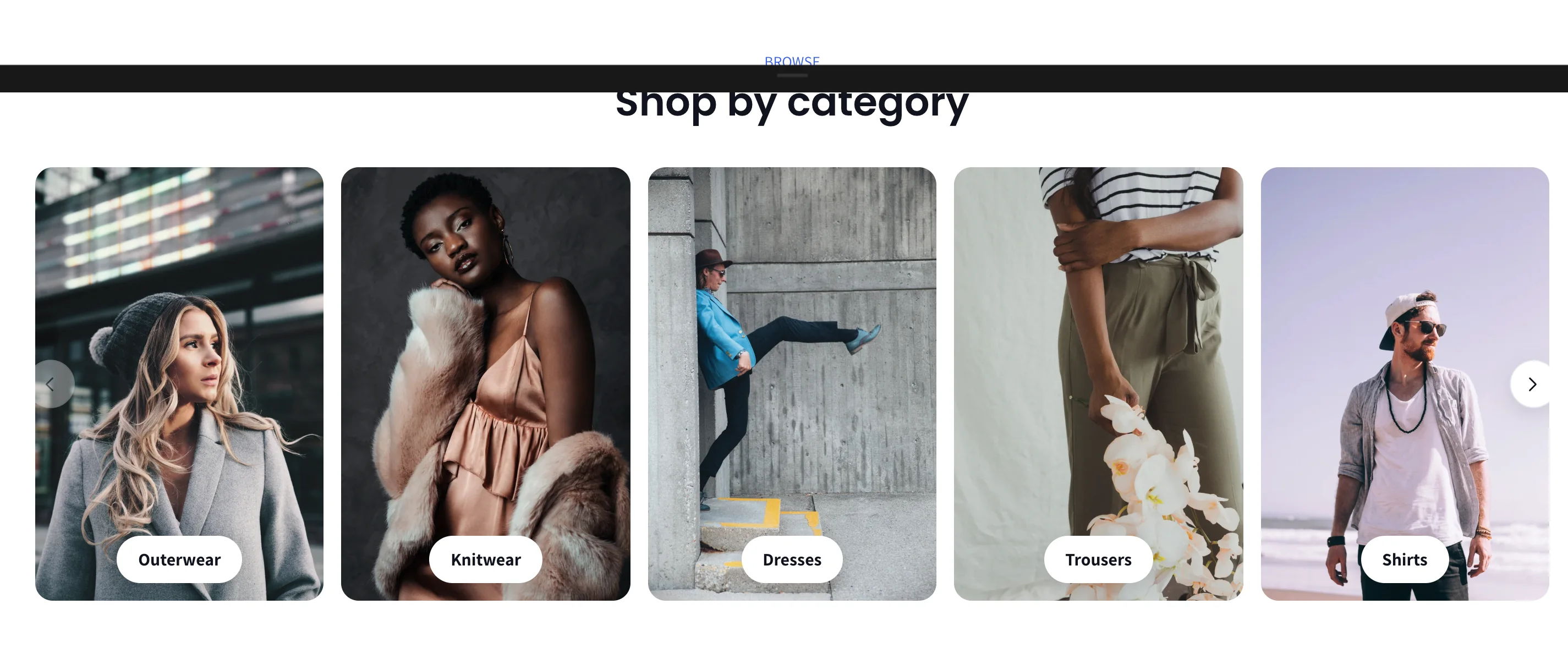
Collection list — Tiles for your collections as a grid or horizontal scroll. Each Collection block can override the image and heading. Choose columns, image ratio, and a label style: an overlay bar, a floating pill, or a label below the image, with horizontal and vertical alignment.
Featured product — A single product with its gallery, price, description and buy button. Supports app blocks and custom Liquid.
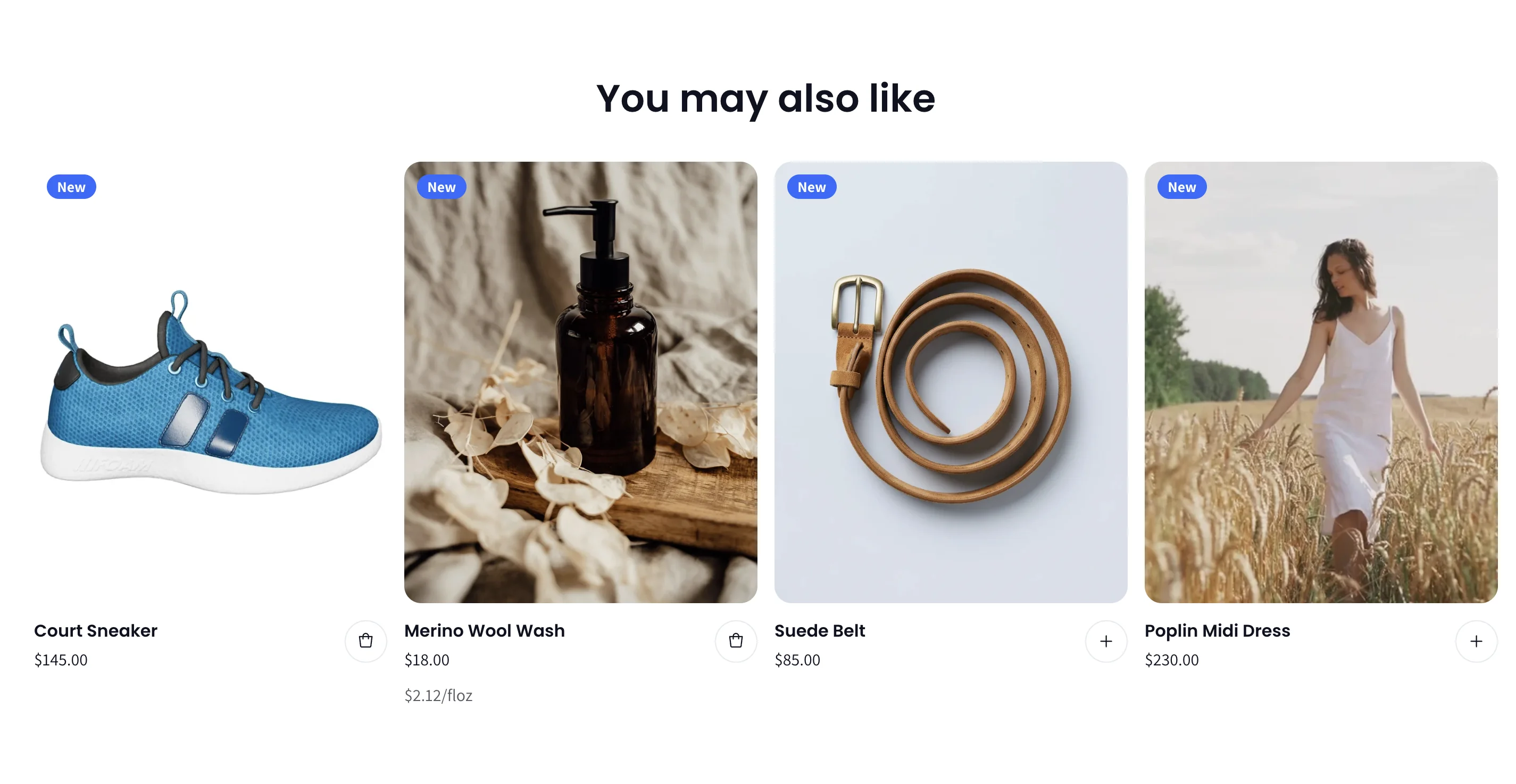
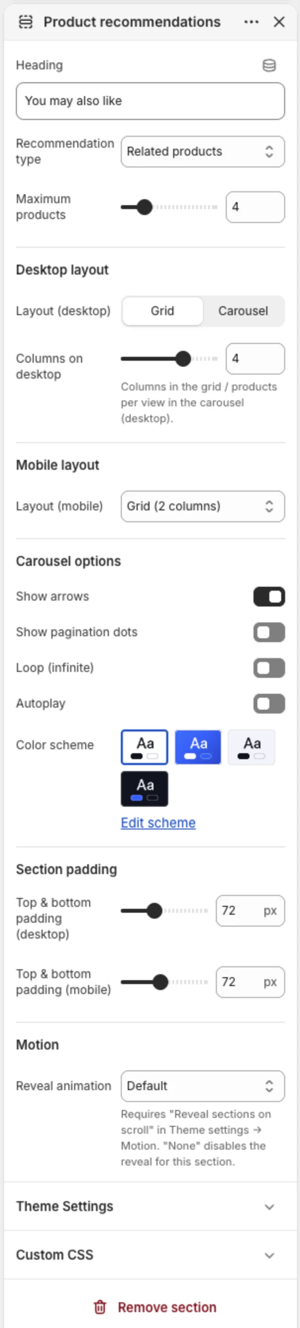
Product recommendations — Usually placed on the product page. Shows Related or Complementary products (set complementary products in the Search & Discovery app). Separate desktop and mobile layouts, grid or carousel.
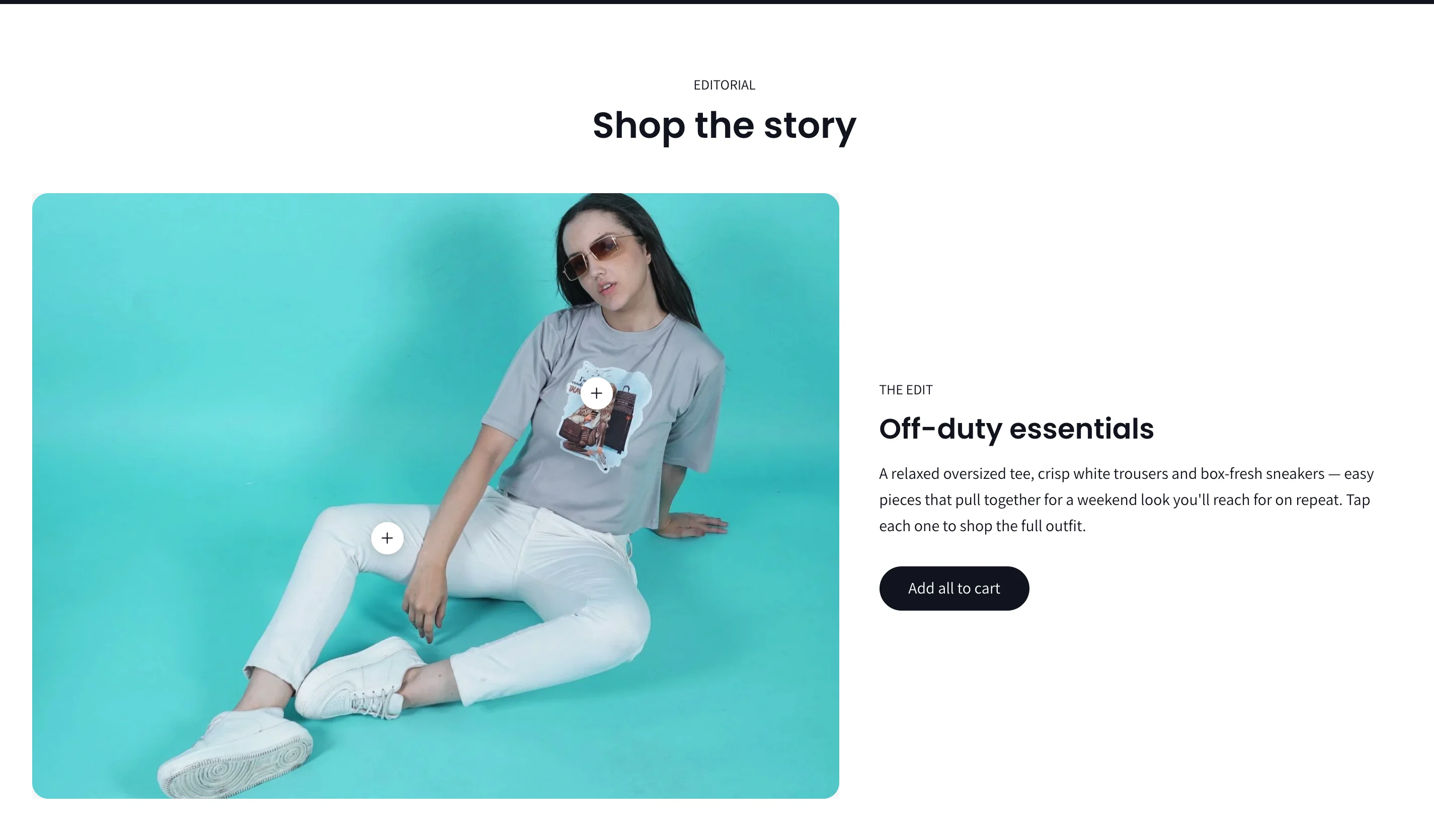
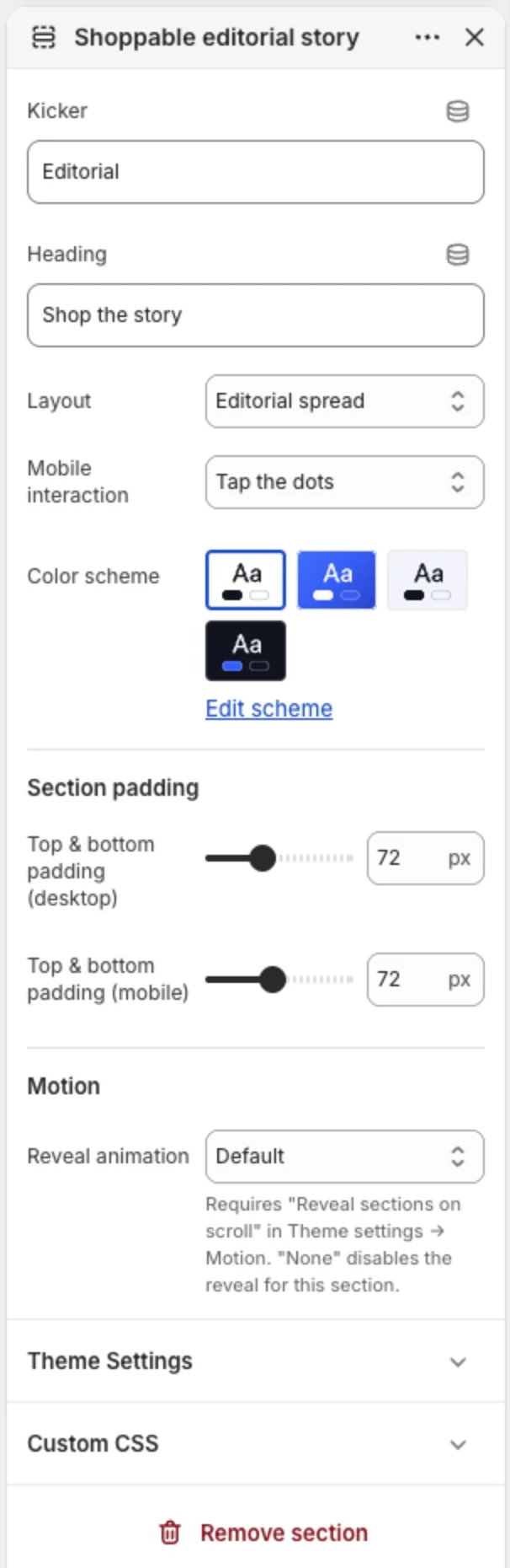
Shoppable editorial story — The theme's signature section. Add a Scene block with a lifestyle image, kicker, heading and text, then add Hotspot blocks to it. Each hotspot is a product pinned to a point on the image (horizontal and vertical position in %). Shoppers tap a dot to see the product and add it to the cart, and an Add all to cart button adds the whole look. Layouts: Editorial spread or Scroll story. On phones, choose Tap the dots or Product list below image.
Collage — A mixed grid of Image, Product and Video tiles. Layouts: large tile on the left, large tile on the right, or an even grid.
Storytelling and trust

Rich text — Kicker, heading, paragraph and button. Good for a brand statement.
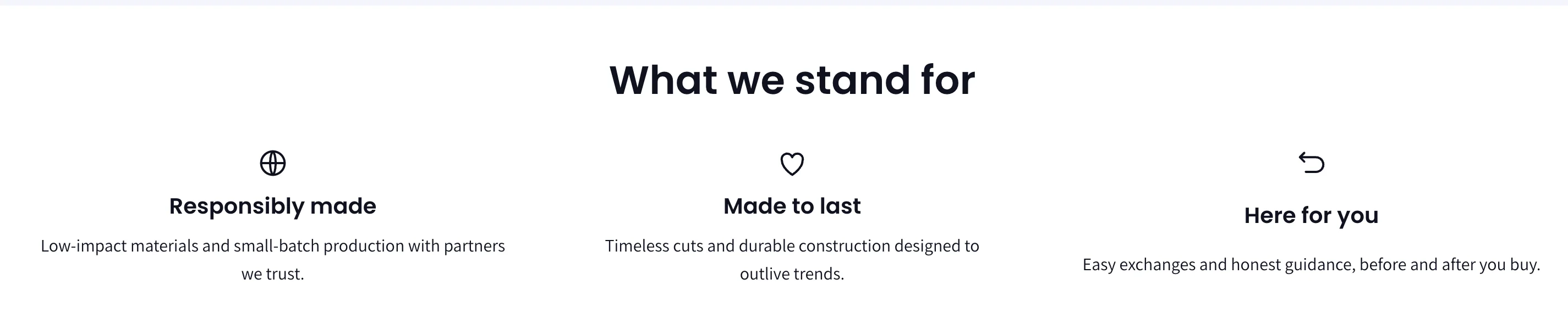
Multicolumn — Two to four columns, each with an image or icon (shipping, returns, size guide, heart, globe), heading, text and link. Style: Stacked columns or Reassurance cards.

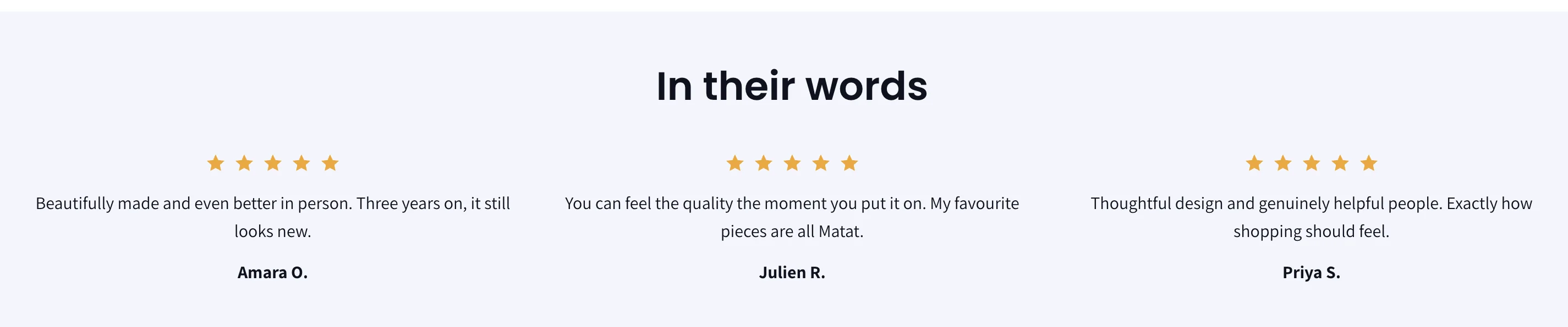
Testimonials — Quote blocks with a star rating, quote and author, as a grid or carousel.
Logo list — A grid of logos (press, stockists, partners) with optional links and grayscale-until-hover.

Logo marquee — The same logos as a continuously scrolling strip.
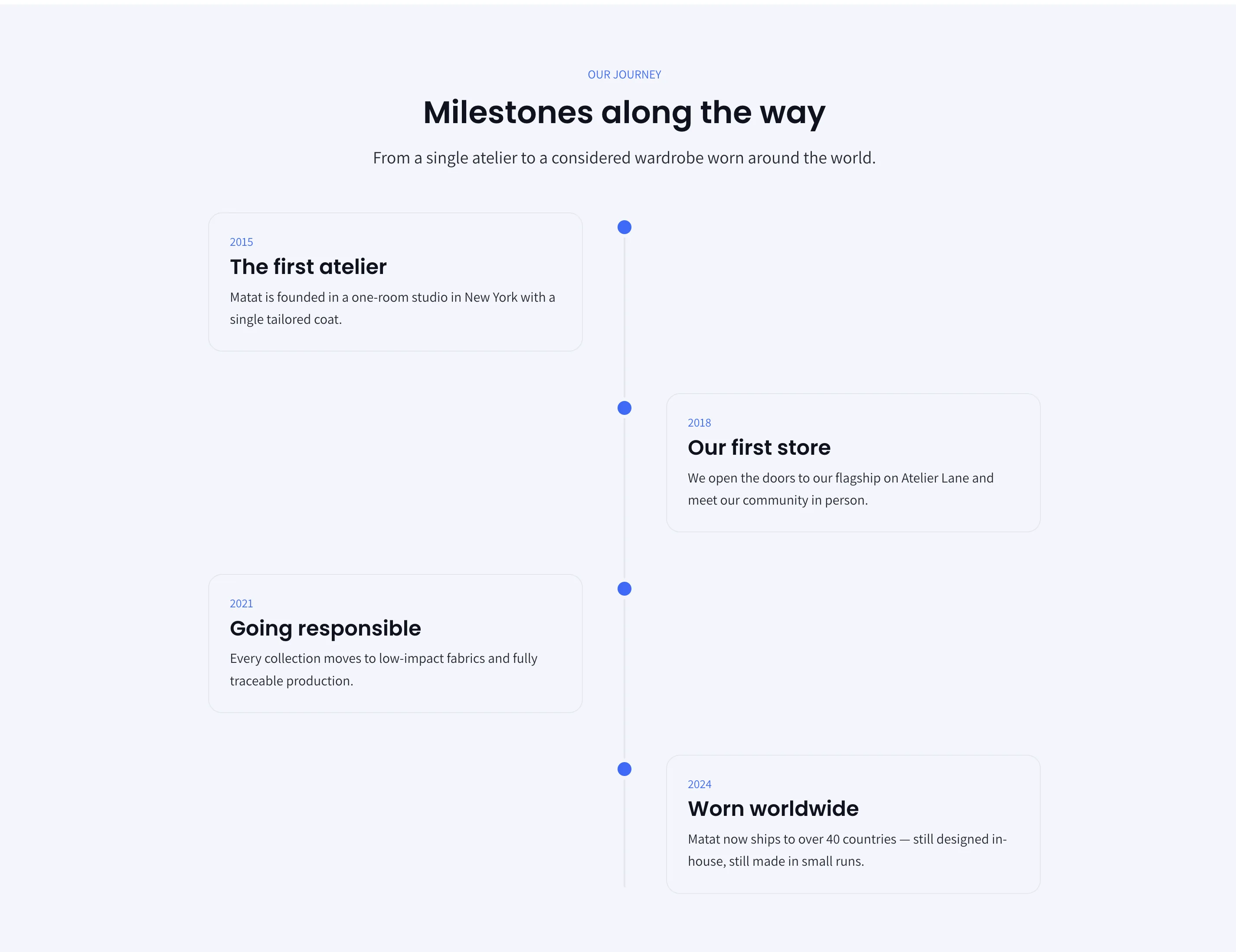
Timeline — A vertical timeline of up to twenty milestones, each with a date, heading and text. Used on the About page template.
Editorial content — A grid or carousel of editorial cards (image, kicker, heading, text, link). Add Editorial item blocks by hand. Advanced: if you have created your own metaobject definition in Shopify (for example editorial_story), enter its type and the field names, and the section renders every entry automatically.
Blog posts — The latest posts from a blog, two to four across, with image, date, excerpt and author toggles.
Video — An uploaded video or a YouTube/Vimeo link with a cover image, heading and text. Autoplay plays muted and looped, and is switched off for visitors who prefer reduced motion.
Collapsible content — An accordion of question-and-answer rows, in a single column or beside an image. Optional FAQ structured data for search engines.
FAQ — A full FAQ page section. Add Group blocks to create categories and Question blocks under them. Options: group navigation as a sticky sidebar or pills at the top, scroll-to or filter behaviour, a live search box that filters questions as the visitor types, toggle or accordion opening, and FAQ structured data.

Newsletter — A sign-up section, centred over an optional image or split beside one, with custom colours available.
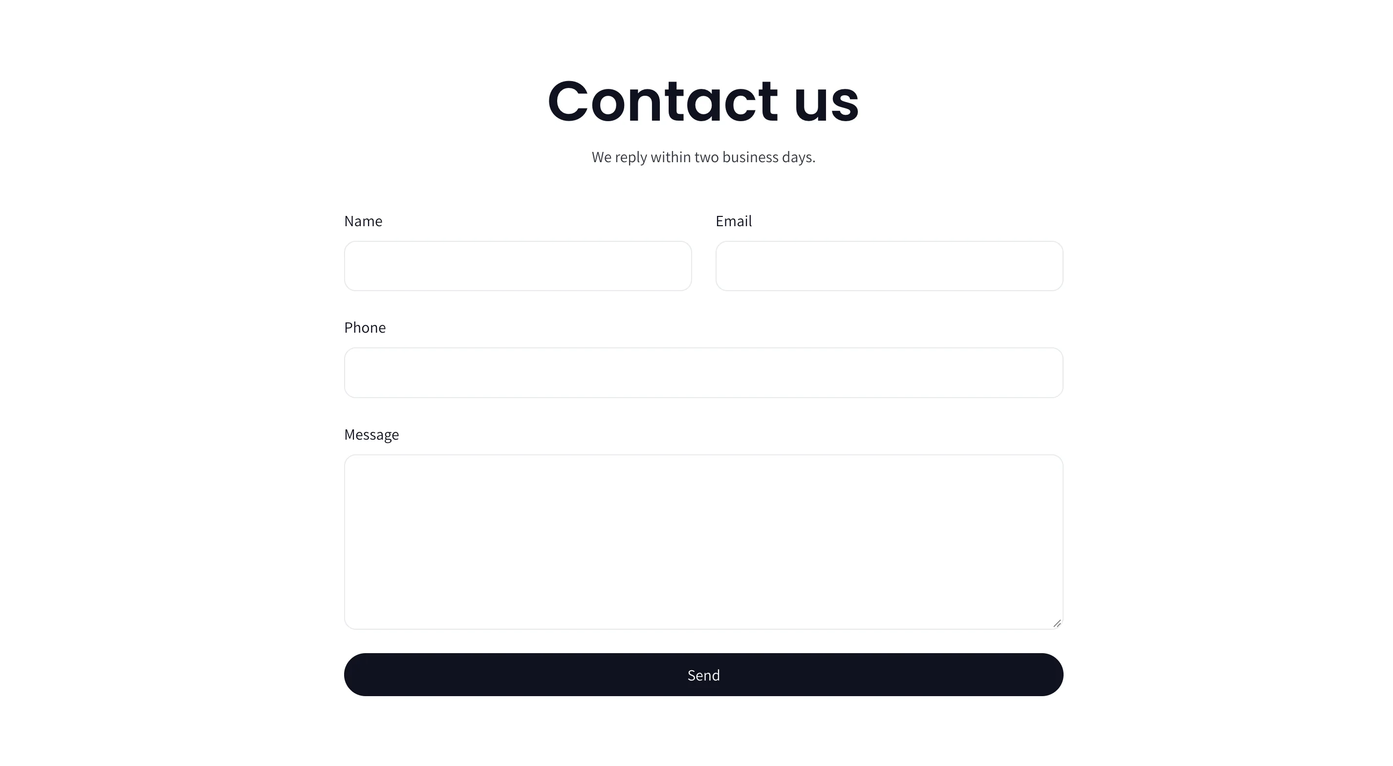
Contact form — Name, email, phone and message, delivered to your store's customer email. Spam protection is handled by Shopify.
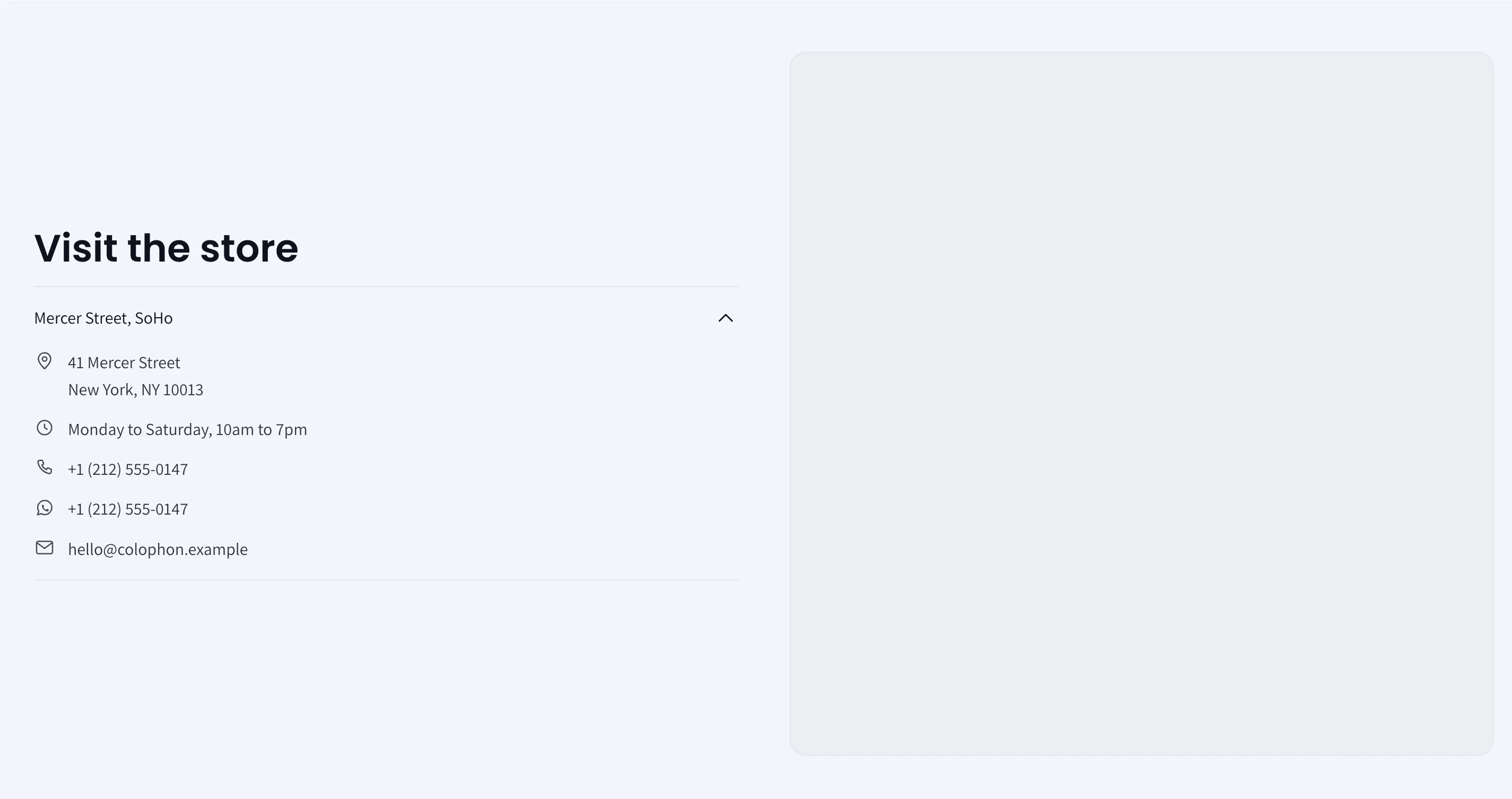
Map — Store locations. Add a Branch block per shop with address, hours, phone, WhatsApp and email. The map can be Dynamic (switches to whichever branch the visitor opens) or Static (one fixed map). Maps are built from the address automatically, or paste a Google Maps "Embed a map" URL.
Custom Liquid — Paste app snippets, HTML or Liquid.
8. Product page
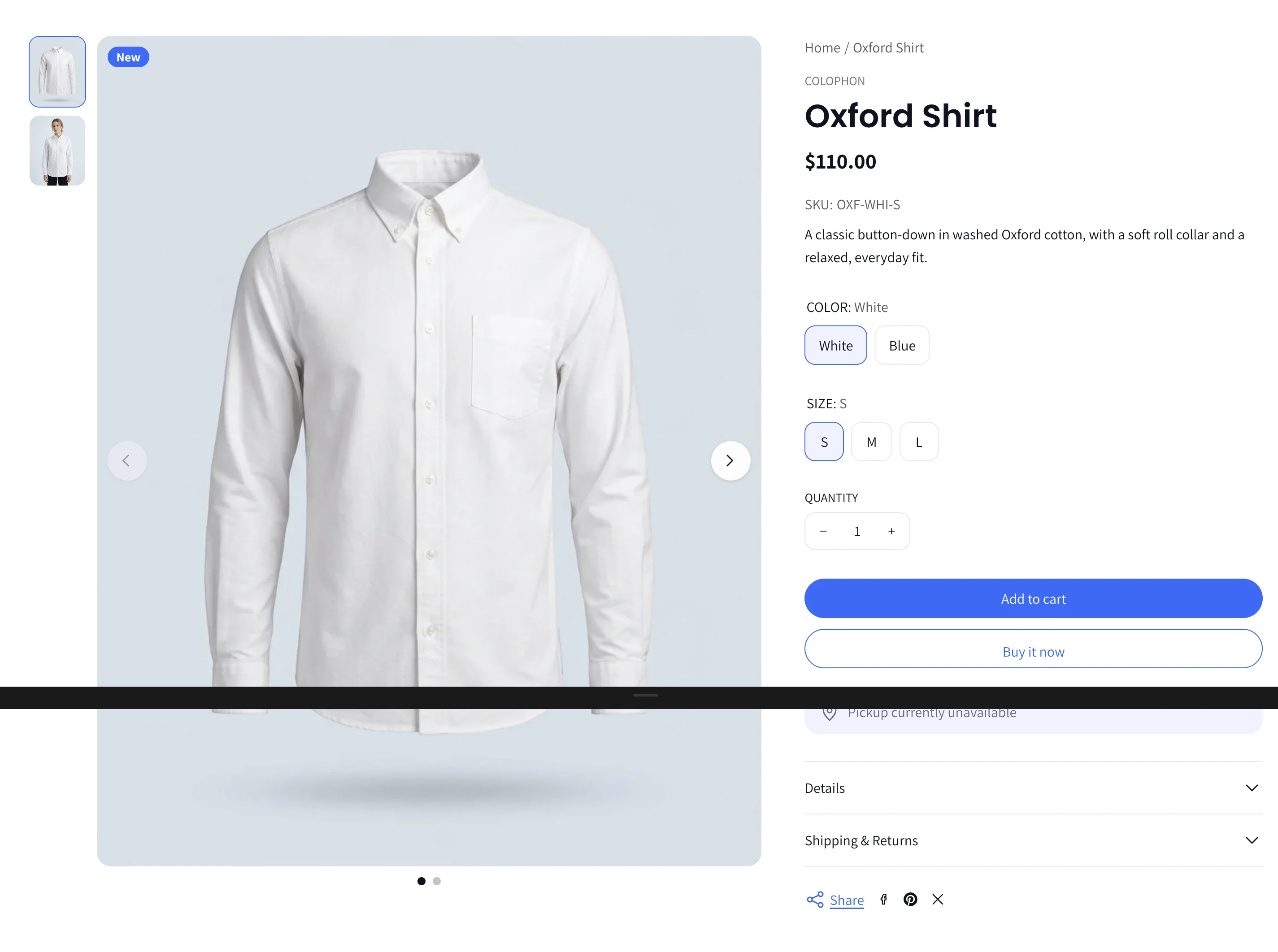
The product page is one section, Product information, with a media gallery on one side and a column of reorderable blocks on the other.
Section settings
Layout
| Setting | What it does |
|---|---|
| Sticky column | On desktop, pins one column below the header while the other scrolls: Shorter column (automatic), Product summary, Product gallery or None. |
Gallery
| Setting | What it does |
|---|---|
| Gallery layout | Grid (images stacked, 1 to 3 per row) or Carousel. |
| Show thumbnails | Thumbnails below, left of, or right of the main image, with a choice of thumbnail ratio. |
| Carousel options | Arrows, dots, loop, autoplay and interval. |
Selecting a variant swaps the gallery to that variant's image automatically.
Video
| Setting | What it does |
|---|---|
| Show video first | Moves product videos to the first slide. |
| Autoplay video / Play with sound / Loop video | Browsers only allow muted autoplay; sound starts after the shopper interacts. |
Main image zoom and lightbox
| Setting | What it does |
|---|---|
| Main image interaction | None, Open lightbox (a full-screen viewer with swipe between images) or Zoom on hover (magnifies in place on desktop, pinch-to-zoom on touch). |
| Open lightbox on | Click the image, or an Expand button in a corner you choose. |
| Allow zoom inside lightbox | Zoom on click or with a zoom button; set the zoom level (1.5× to 4×). |
| Close on Esc / overlay click, Overlay opacity | Lightbox behaviour. |
Buy area
| Setting | What it does |
|---|---|
| Show sticky add to cart on scroll | A compact bar with the product, price and Add to cart appears when the main button scrolls out of view. |

Product blocks
Add, remove and drag these blocks to build the information column.
| Block | What it does |
|---|---|
| Breadcrumb | Home → Collection → Product. Inside the column or full width above the gallery, with alignment. |
| Vendor | The product's brand. |
| Title | The product name. |
| Price | Price, compare-at price and sale badge. Option to show unit price. |
| SKU | The selected variant's SKU with a custom label. |
| Description | The product description. |
| Variant picker | Buttons for options, with colour swatches for colour options (see Swatches below). Sold-out values are shown crossed out. |
| Size chart | A link that opens a page or an image (separate desktop and mobile images) as a popup or in a new tab. |
| Quantity selector | A plus/minus stepper that respects any stock limit. |
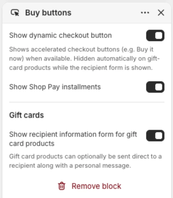
| Buy buttons | Add to cart, optional accelerated checkout (Shop Pay, Apple Pay, etc.), optional Shop Pay Installments, and the recipient form for gift-card products (send to someone else with a message and date). |
| Pickup availability | Shows which of your locations have the item for pickup. |
| Product tabs | Tabs in the column or full width below the product. Each Tab block shows custom text, the product description, a page, or related products. Behaviour: real tabs or scroll-to-section. |
| Collapsible row | An accordion row with text or a page, an optional icon (shipping, returns, size guide), open by default or closed. Use several for Shipping, Returns, Care. |
| Spec table | A two-column table for sizes or specs, inline or in a popup. Content from Spec row blocks, a page, or rich text. The rich-text option can be connected to a product metafield for per-product tables. |
| Complementary products | Small cards for products set as complementary in Search & Discovery. |
| Share | Copy-link and social sharing, below the summary or below the gallery. |
| Custom Liquid | Code or app snippets. |
| App blocks | Reviews, size guides and other apps that support theme blocks. |
Badges
Product cards and the product page show badges automatically:
- Sold out when no variant is available.
- Sale (with the discount, depending on your Product cards settings) when the price is below the compare-at price.
- New for products created in the last 30 days.
- A custom badge such as "Best seller" if you add a product metafield with namespace
customand keybadgeand give it a text value.
Colour swatches
Swatches use Shopify's native option swatches. In the product's options, choose the Color option type and set a colour or an image for each value. The theme shows those swatches on product cards and in the variant picker. If an option value has no native swatch, the theme tries to match the colour name.
9. Product cards
Theme settings → Product cards controls every product card in the store.
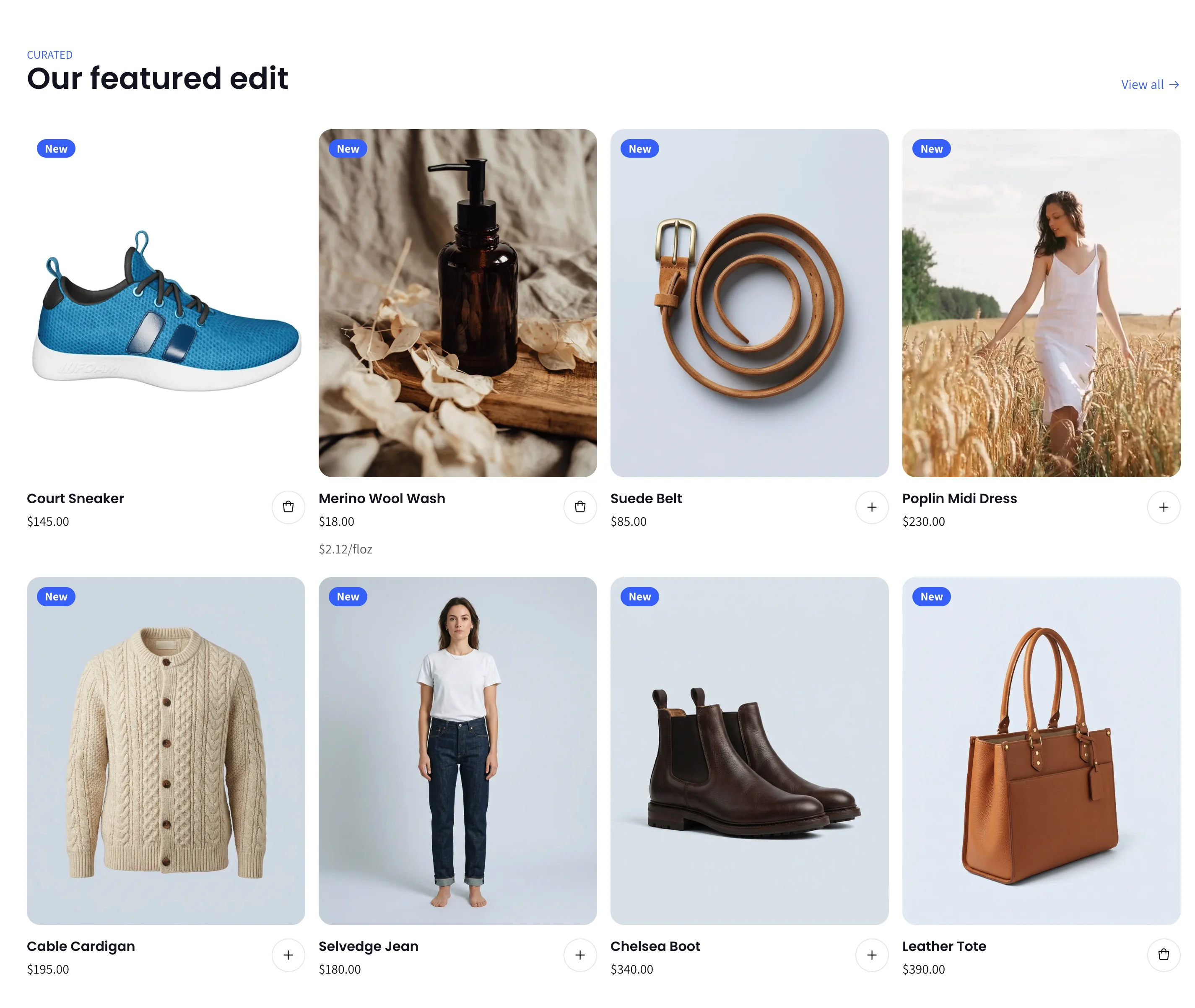
| Setting | What it does |
|---|---|
| Image ratio | Portrait, Square or Adapt to image. Portrait suits fashion; use Adapt when product images vary in shape. |
| Show second image on hover | Shows the second product image on hover. |
| Play product video | If the product has a video, it plays muted on the card instead of the images. |
| Show all images in a carousel | Lets shoppers swipe through every product image on the card, with optional arrows, dots and loop. |
| Show vendor | Shows the brand above the title. |
| Show color swatches | Shows the product's colour options as small dots under the title. |
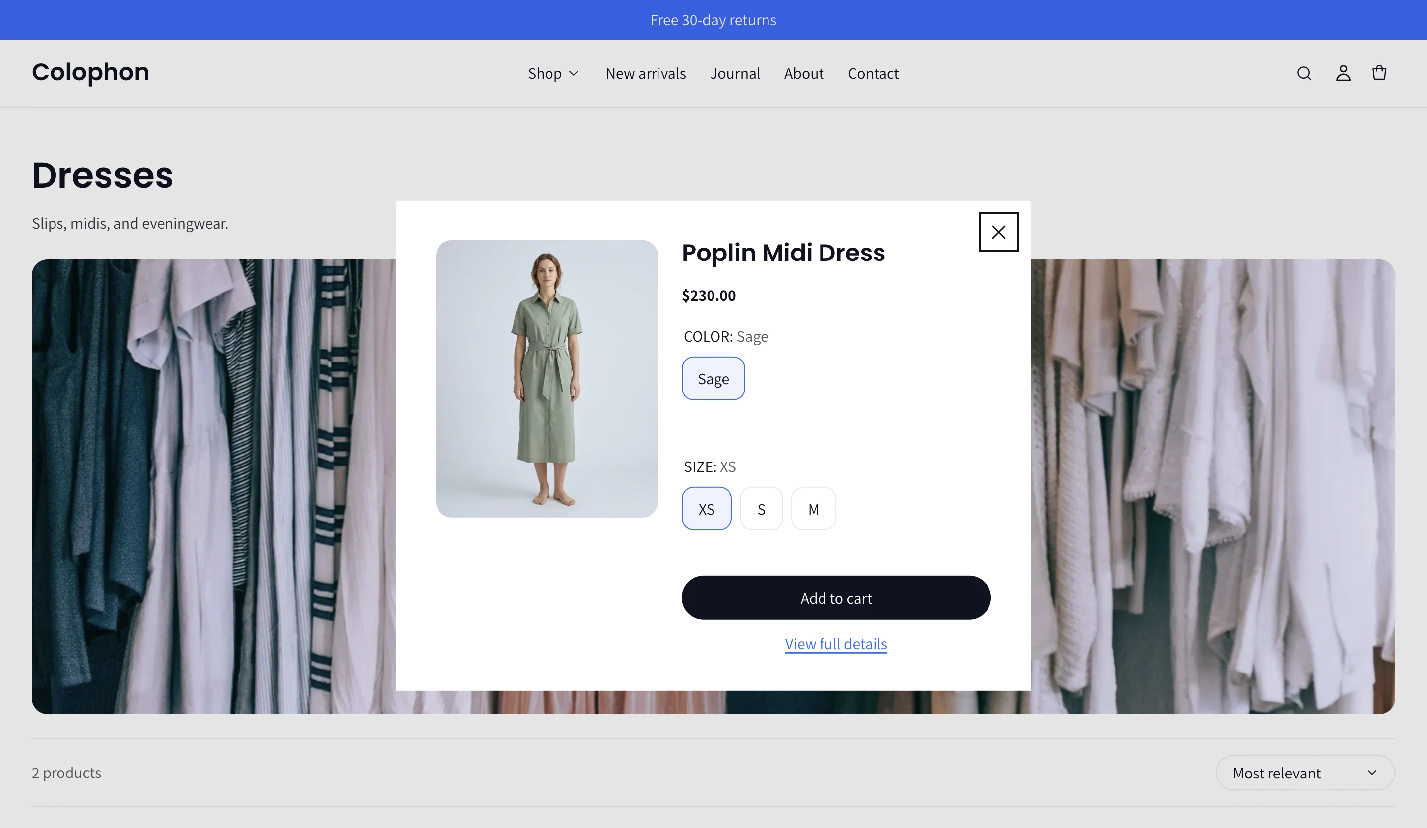
| Enable quick add | Adds a quick-add control. Single-variant products add straight to the cart; products with options open a small dialog to choose them. |
| Show discount next to price | On: the discount appears beside the price. Off: it appears as a badge over the image. |
| Sale label | Text + percentage (Sale −25%), Percentage only (−25%) or Text only (Sale). |
| Sale badge text | The word used for the sale label. |

The card itself is built from blocks (image, title, price, vendor, description, swatches, quick add). In sections that show products, you can open the Product card block to reorder these or change the quick-add style (a full button, or an icon placed below the details, next to the title or on the image).
10. Collection pages
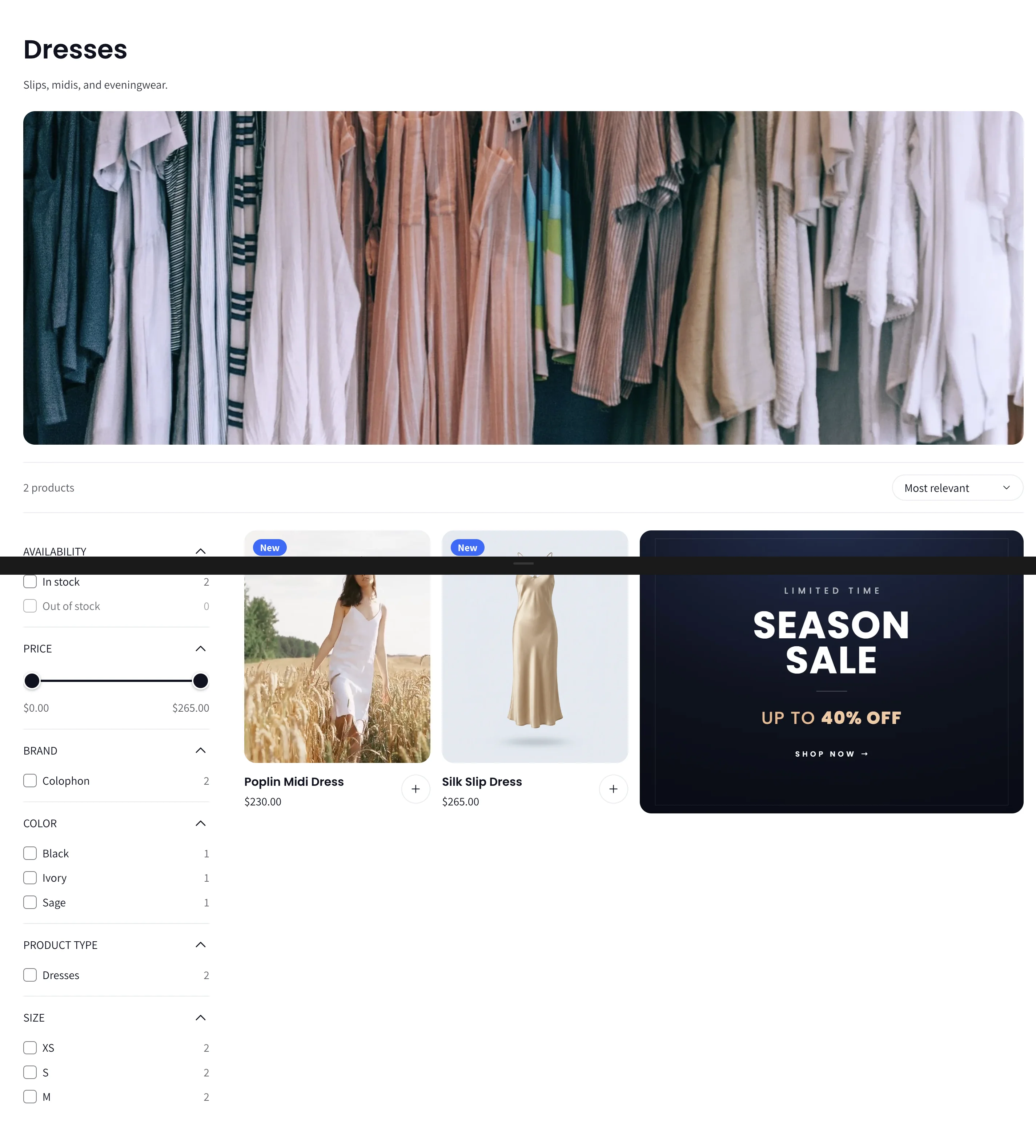
The Collection section is the main product grid.
Header and banner
| Setting | What it does |
|---|---|
| Header alignment | Left or Center. |
| Show description | Shows the collection description. |
| Show header banner | Uses the collection's own image as a banner. Default banner image is used for collections without one. |
| Title & description position | Above the banner, below it, or on it (with vertical and horizontal caption position). |
| Header background color | A colour band behind the title, or behind the banner for collections with no image. |
| Header width | Boxed or full width. |
Tip: set a collection's image under Products → Collections → (collection) → Collection image. Wide images (about 4:1) work best.
Subcategory pills
Colophon can show a row of subcategory links under the collection header, for example Dresses → Midi, Mini, Maxi.
- In Online Store → Navigation, create a menu whose handle matches the collection's handle (for example a menu with handle
dressesfor the collection at/collections/dresses). - Add the links you want as pills.
The row becomes a swipeable slider when it overflows, with optional arrows, dots and autoplay. The current collection is highlighted.
Grid, filters and sorting
| Setting | What it does |
|---|---|
| Products per page | 8 to 48. |
| Columns on desktop | 2 to 5. Phones show 2. |
| Column spacing / Row spacing | Gaps in the grid. |
| Filter layout | Sidebar (filters beside the grid on desktop) or Drawer (a slide-out panel). Phones always use the drawer. |
| Sticky subcategories / filter & sort bar / filter sidebar | Keep those elements pinned below the header while scrolling. |

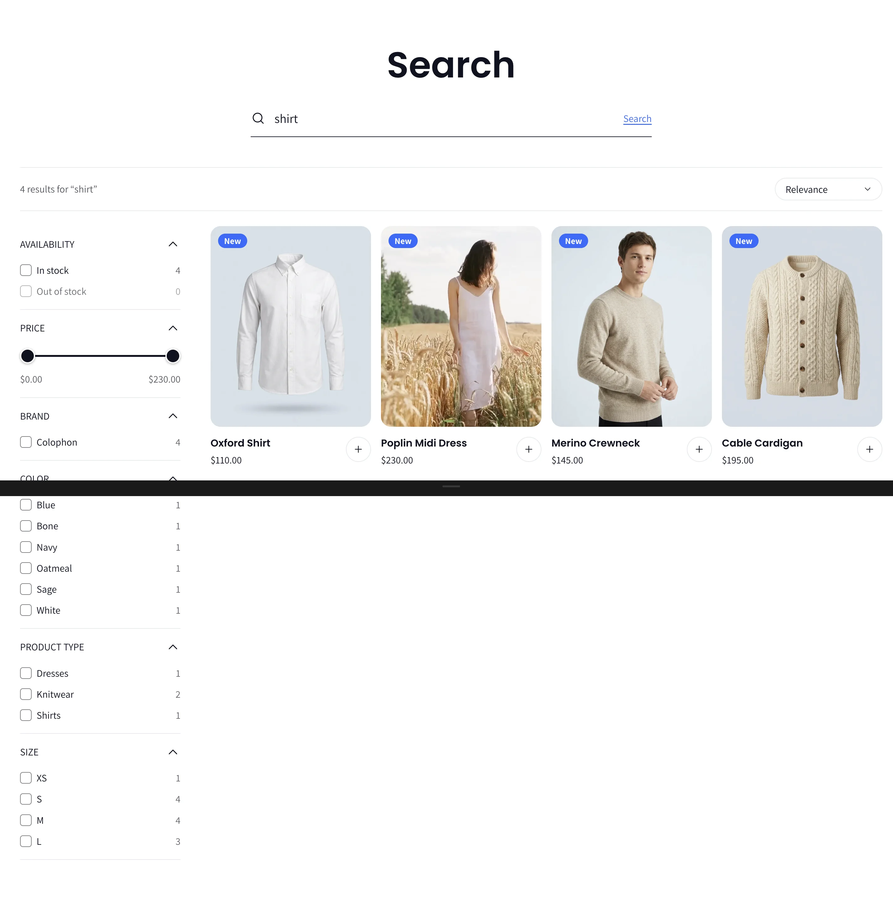
Filters and sort options come from the Search & Discovery app: availability, price range, colour, size, product type, vendor and any custom filters you create. Active filters show as removable chips.
Pagination style (numbered pages, load more, or infinite scroll) is set once in Theme settings → Layout.
Editorial tile (merchandising canvas)
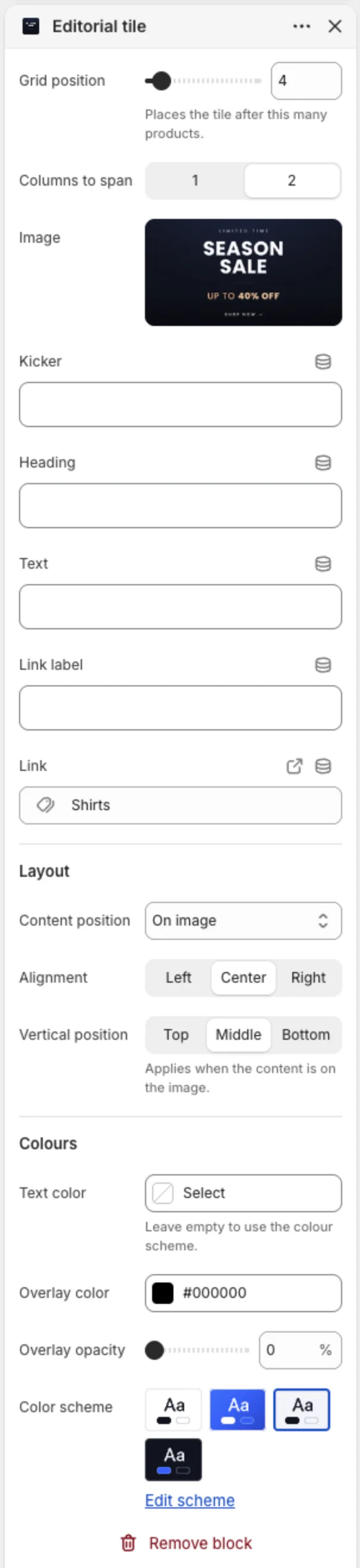
Add an Editorial tile block to drop a promotional or editorial tile inside the product grid.
| Setting | What it does |
|---|---|
| Grid position | The tile appears after this many products. |
| Columns to span | 1 or 2 columns. |
| Image, kicker, heading, text, link label, link | The tile content. |
| Content position | Above the image, on the image (with alignment and vertical position, overlay colour and opacity), or below it. |
| Text color / Color scheme | Colours for the tile. |
Collections list page
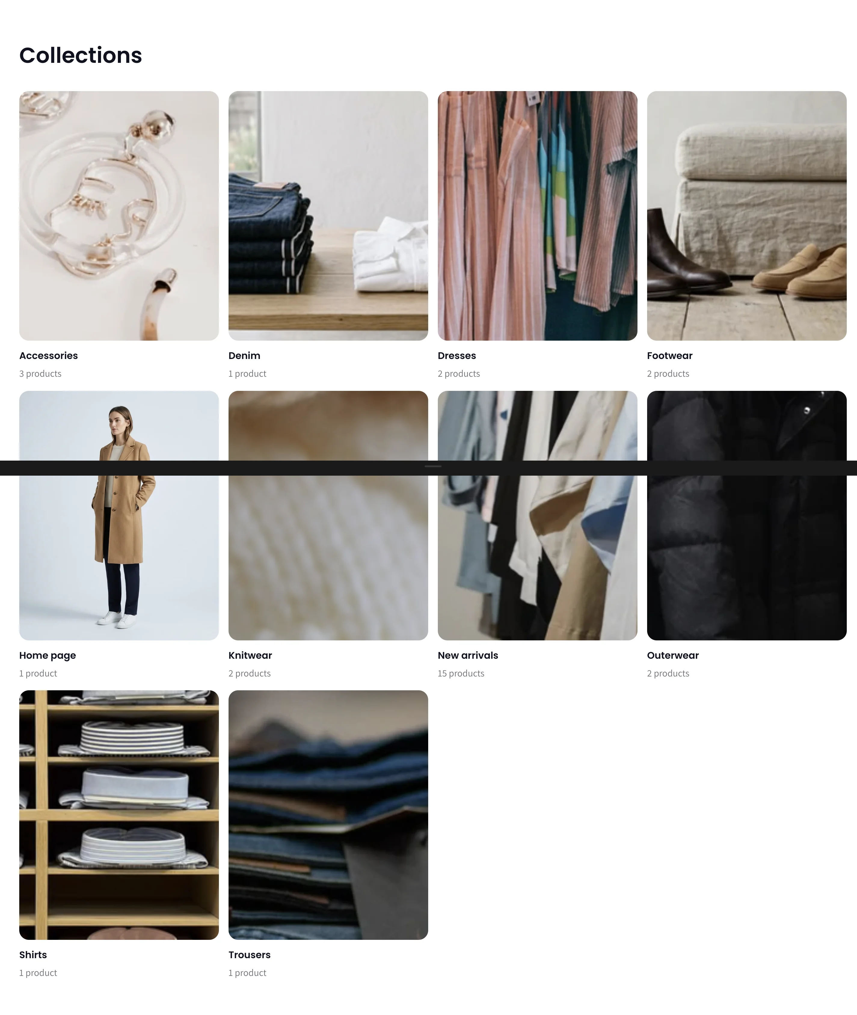
The Collections list section (at /collections) shows every collection as tiles, with columns, items per page and image ratio.
11. Search
Theme settings → Search controls the search experience everywhere.
| Setting | What it does |
|---|---|
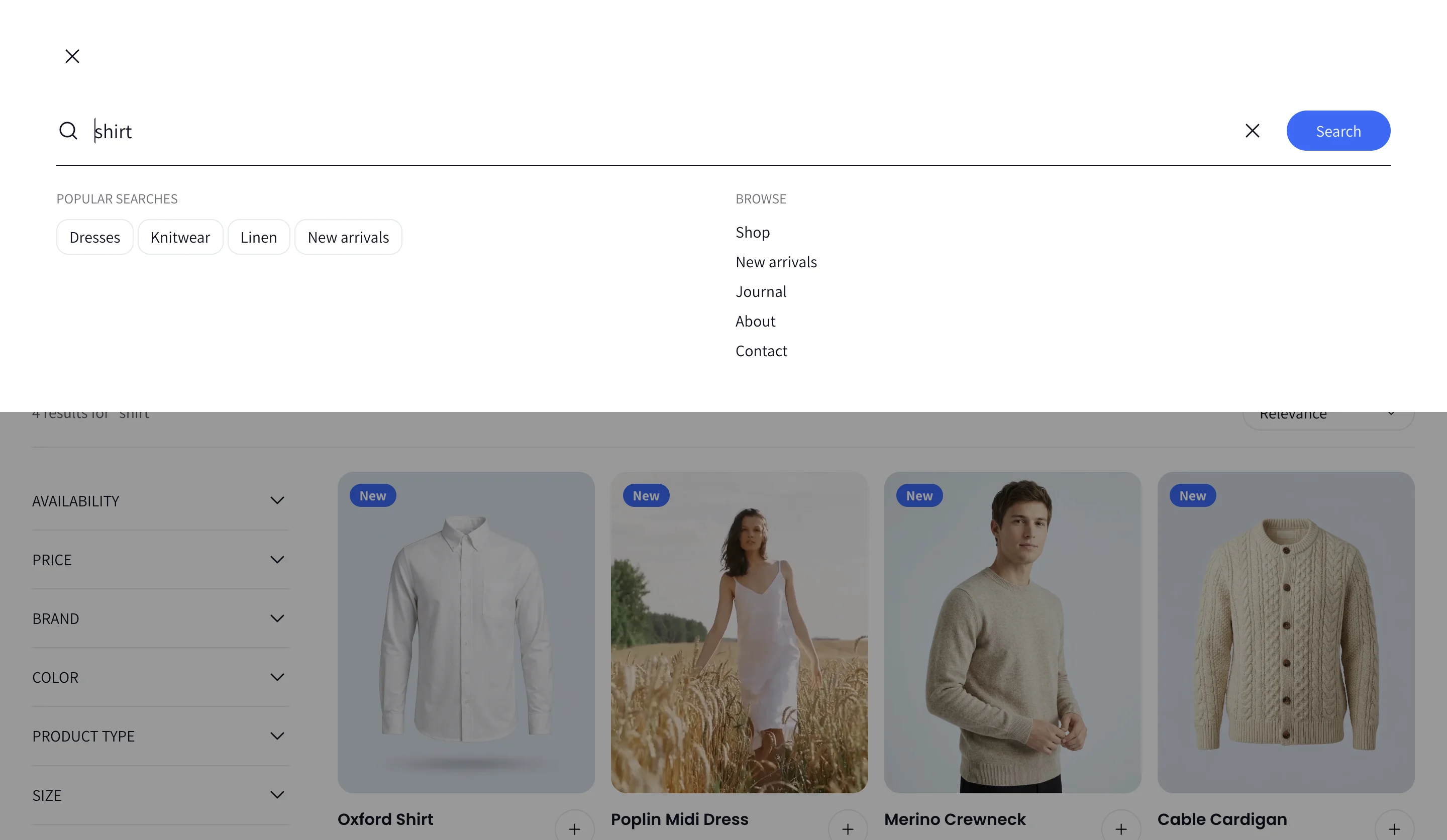
| Search style | Full-width drawer (opens below the header), Centered popup, Always-visible field (a search box in the header), Expanding field (an icon that grows into a field) or Open search bar. |
| Enable predictive search | Live results as the shopper types. When off, search goes straight to the results page. |
| Show products / collections / pages / blog articles | Which result types appear in the live panel. |
| Maximum results per type | 2 to 10. |
| Suggested searches | A heading and comma-separated terms shown before the shopper types (for example New in, Best sellers, Sale). |
| Browse column | A heading and a menu of quick links shown in the search panel. |
| Promotion | An image, heading, text and button shown in the panel, for example a current campaign. |

The contact details from Theme settings → Contact also appear in the search panel so shoppers can reach you if they cannot find something. Search works without JavaScript too: the form submits to the results page.
The Search results page shows matching products in a filterable grid, with columns and products per page settings, plus pages and articles.
12. Cart and checkout
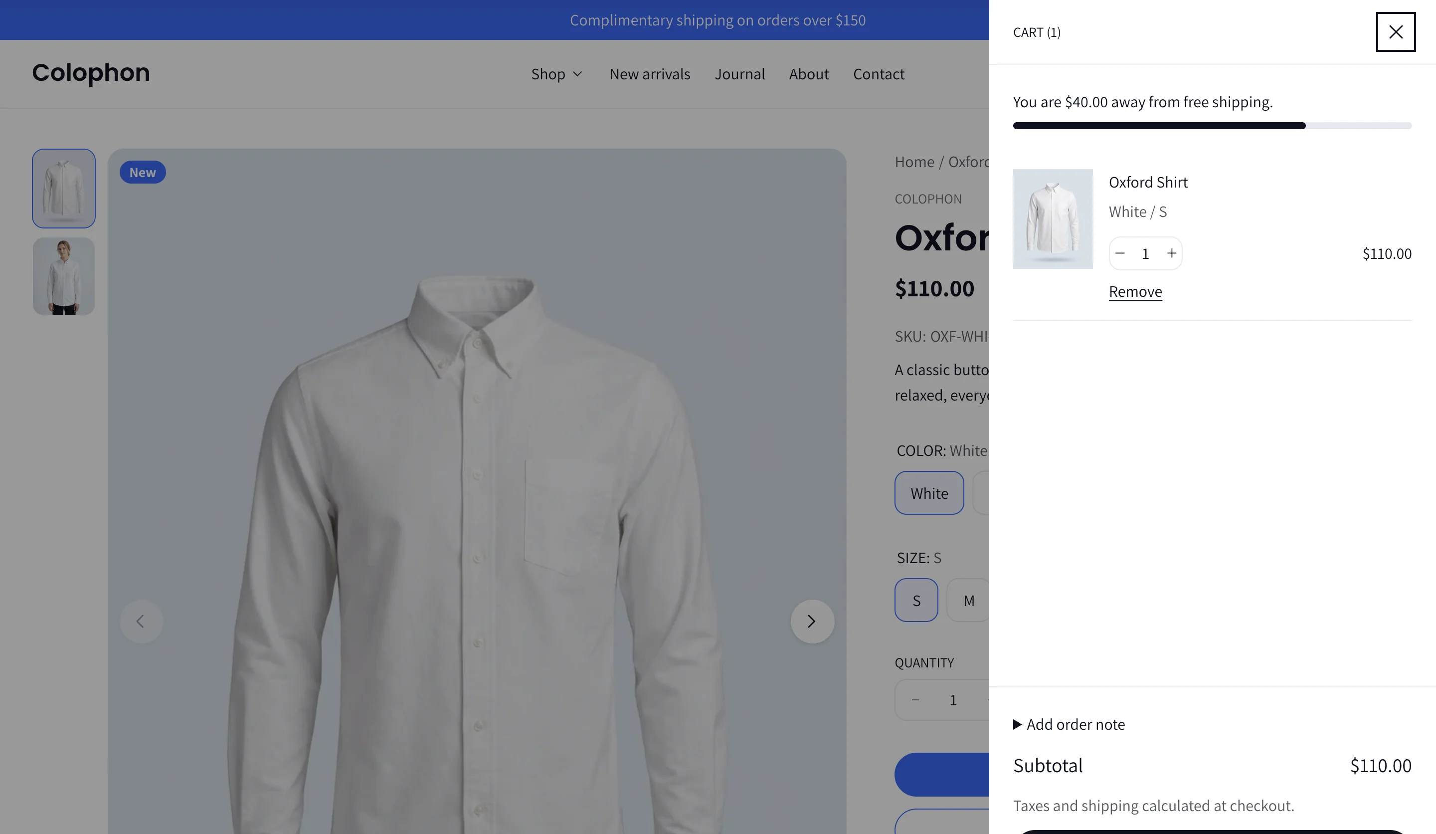
- Cart drawer or page — chosen in Theme settings → Cart. The drawer opens when an item is added and lets shoppers change quantities, remove lines and see line-level discounts without leaving the page. The cart page offers the same features full width.
- Free shipping bar — "Spend X more for free shipping" with a progress bar, turning into a success message once the threshold is reached.
- Cart notes — an optional note field.
- Quick add — from product cards; products with options open a dialog with the variant picker.
- Stock limits — the quantity stepper and add-to-cart show a clear message when a shopper tries to add more than is available.
- Gift cards — the Buy buttons block shows an optional recipient form (name, email, message, send date) on gift-card products.
- Checkout — Shopify's checkout. Accelerated checkout buttons (Shop Pay, Apple Pay, Google Pay, PayPal) appear when enabled in your payment settings.
13. Blog
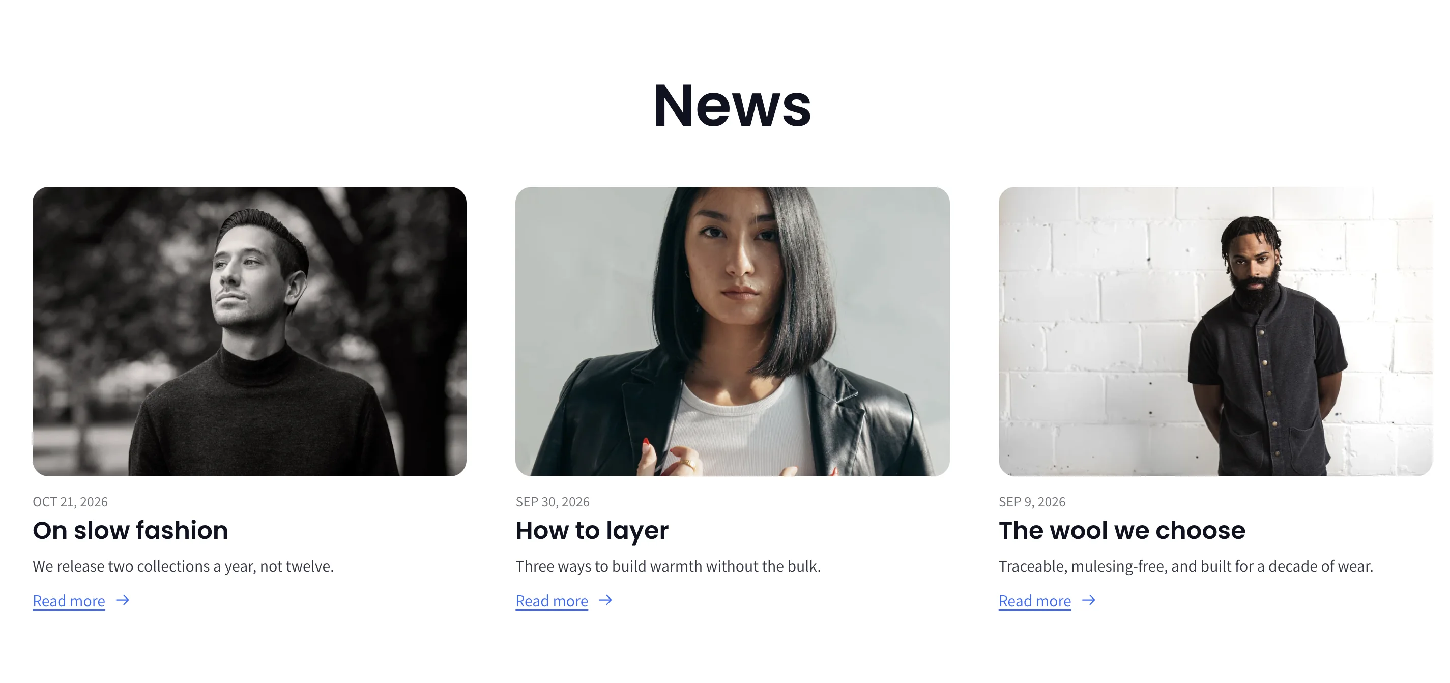
Blog page (Blog posts section) — Posts as a grid, 1 to 4 columns, with posts per page, image ratio, excerpt (and how many lines), "Read more" text, tags (on the image, above or below the title), date and author.
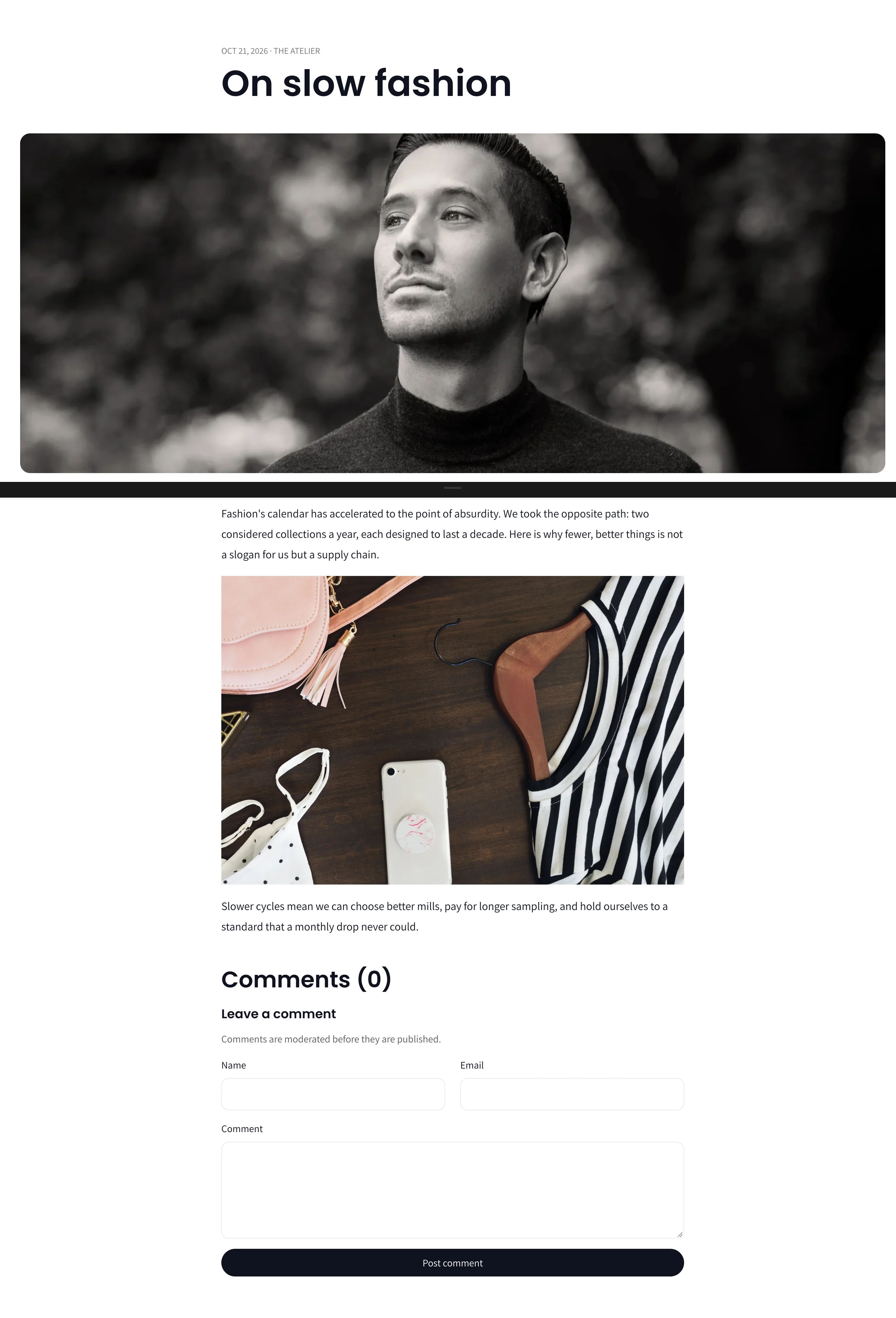
Article page — Featured image ratio and width (content width, wide or full screen), title position above or below the image, content width and alignment, tags, date and author position. Images inside the post can open in a lightbox (Theme settings → Lightbox).
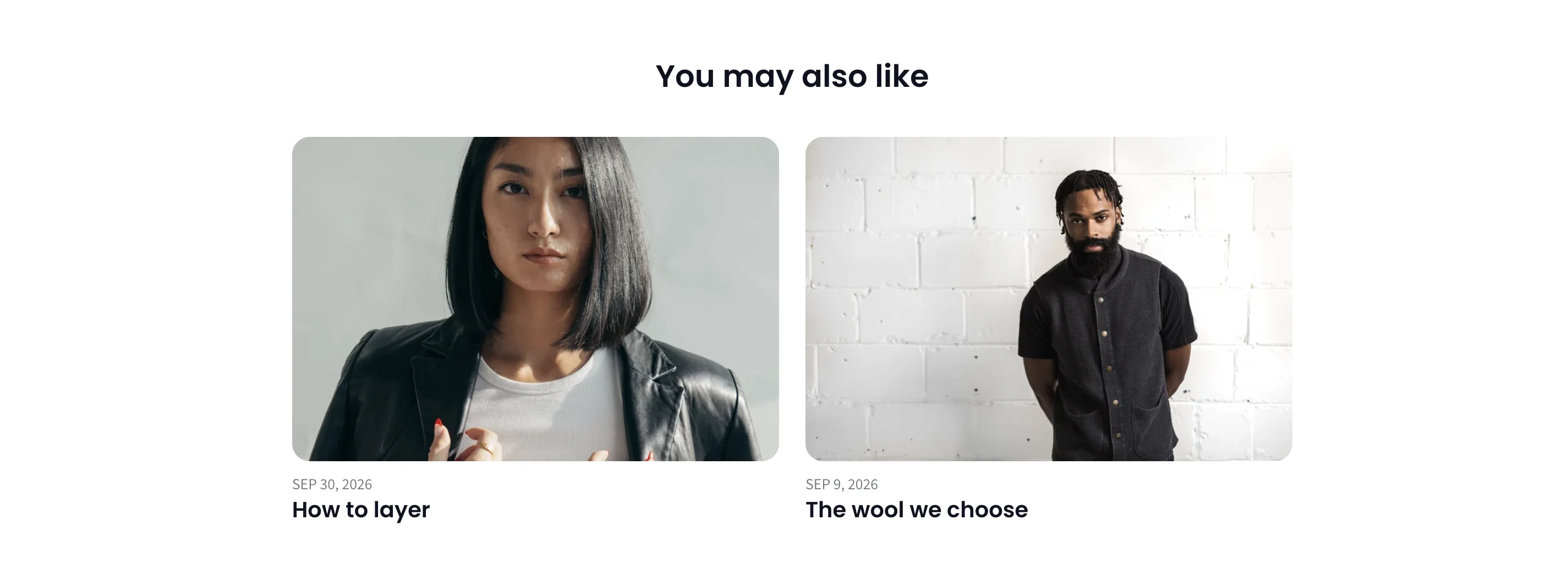
Related posts — Shown under an article as a grid or carousel with date and image-ratio options.
14. Other pages and templates
Page templates
Assign a template to a page under Online Store → Pages → (page) → Theme template.
| Template | What it includes |
|---|---|
| Default page | The page content, with support for app blocks and theme blocks. |
| about | Cinematic hero, image-with-text sections, rich text, multicolumn, timeline, testimonials and newsletter. Replace the demo content with your story. |
| contact | A contact form and the Map section with branches. |
| faq | A hero, the FAQ section with groups and questions, and a newsletter. |
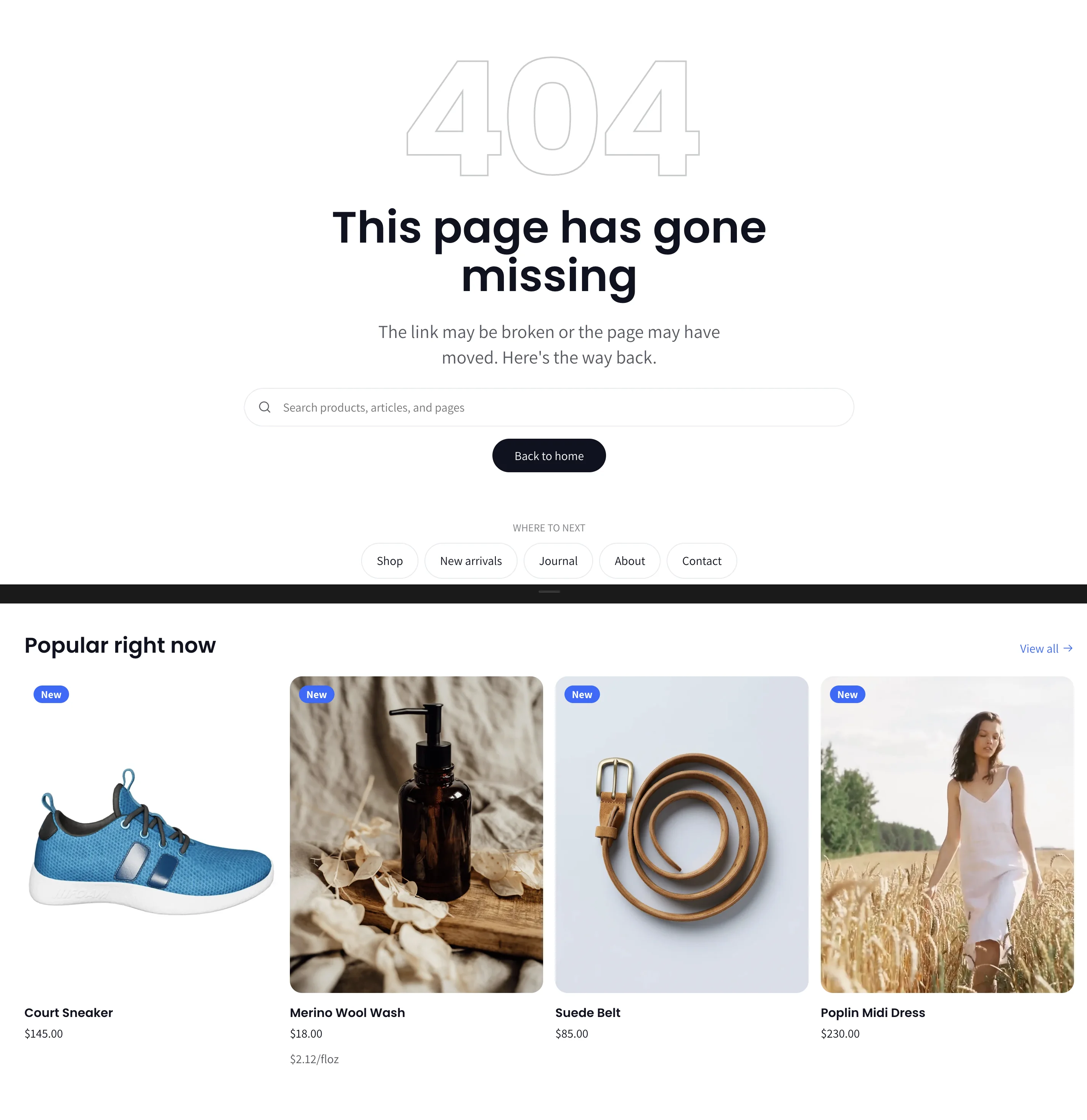
404 page
Heading and text, a home button, a search button or inline search, a menu of recovery links, and a grid or carousel of products from a collection you choose.
Password page
Shown when the store is password-protected. Set the heading and colour scheme; the password form and your store's message are shown automatically.
Gift card page
The page a recipient opens from their email. It shows the balance, the gift-card code with a Copy button, a scannable QR code for in-store use and an Add to Apple Wallet button. No setup needed.
Customer accounts
Login, register, account, order history, order detail, addresses, password reset and account activation pages are all styled to match the theme. Logged-in customers see the Customer account menu from the header settings.
15. Languages, markets and RTL
- The storefront text ships in English, French, German, Spanish and Hebrew. Add or edit translations under Online Store → Themes → Edit default theme content, or add more languages with Shopify Translate & Adapt.
- Right-to-left languages (for example Hebrew or Arabic) are fully supported: the layout, icons and drawers mirror automatically.
- Country/currency and language selectors appear in the header and footer when you have more than one market or language active in Settings → Markets.
16. Images, performance and accessibility
Recommended image sizes
| Where | Size and shape |
|---|---|
| Hero slider, slideshow, cinematic hero | 2400 × 1350 px (16:9) for desktop; 1200 × 1600 px (3:4) for the optional mobile image. |
| Product images | 2048 × 2560 px (4:5 portrait) or square, consistent across the catalog. |
| Collection images (banners) | 2400 × 600 px (about 4:1). |
| Collection list tiles | Same shape as the Image ratio you choose, at least 1200 px on the short side. |
| Logo | SVG, or PNG at least 600 px wide with a transparent background. |
| Favicon | 512 × 512 px square. |
Shopify compresses and resizes uploads automatically. Keep source files under 20 MB.
Performance — Colophon is written with native CSS and lightweight JavaScript, lazy-loads images, and keeps the first screen fast. Keep hero videos short and under 10 MB, and avoid stacking many autoplaying sections on one page.
Accessibility — The theme is built to WCAG 2.2 AA guidelines: keyboard navigation for menus, drawers, carousels and the lightbox, visible focus states, labelled controls, contrast-checked colour schemes and a reduce-motion mode. When you choose custom colours, keep text and background contrast high.
17. Troubleshooting and FAQ
Filters do not appear on collection pages. Install the free Search & Discovery app and turn on the filters you want. Filters with no matching products are hidden.
My subcategory pills are missing. Create a menu whose handle is exactly the collection handle (Online Store → Navigation → Add menu, then check the handle in the menu URL).
The mega menu does not show. In the Mega menu block, Attach to menu item must match the top-level menu item title exactly, including capitalisation.
Colour swatches show as text. Set the option type to Color and add a swatch colour or image to each value in the product's options. Make sure Show color swatches is on in Theme settings → Product cards.
Complementary products are empty. Set them per product in the Search & Discovery app under Product recommendations.
The video does not play with sound. Browsers block autoplay with sound. The video starts muted and sound is available after the shopper interacts.
Animations are not playing. Check Theme settings → Motion. The theme also disables animation automatically for visitors who prefer reduced motion.
The header is transparent on pages without a hero. Turn off Transparent over first section, or keep it only on templates whose first section has a full-bleed image.
Free shipping bar shows the wrong amount. The threshold is set in Theme settings → Cart and must match the free-shipping rate in Settings → Shipping.
I changed style and my colours changed. Styles replace colour schemes and fonts. Reapply your own colours under Theme settings → Colors, or switch back to the previous style.
The countdown ended early. Check the end date (YYYY-MM-DD) and time (24-hour). The timer uses the visitor's local time zone.
18. Support
Use the support form at https://colophon.matat.io/support/. Tell us your store URL, the page you are looking at and what you expected to see, and attach a screenshot if you can. You will get a confirmation email with a reference number, and we reply within two business days. We fix bugs and answer questions about the theme; custom design work is quoted separately.
Release notes: see the theme's changelog in the Theme Store listing.
Shopify's own guides for the theme editor: https://help.shopify.com/manual/online-store/themes